Research and Context : Women’s Safety and Invisible Labour
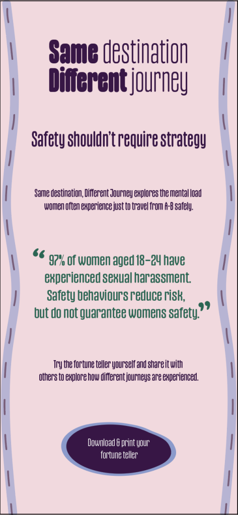
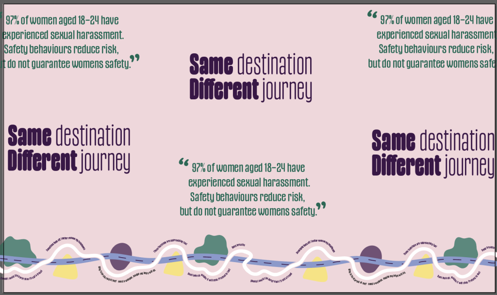
My research begins with a personal observation, as I have grown in age and experience, I have not grown in confidence when it comes to feeling safe in public spaces alone as a woman. Instead, over time this awareness has developed into increased fear, anxiety, and an understanding of the need for constant vigilance. While this is rooted in personal experience, it also reflects a much wider reality. Research by UN Women UK found that ‘97% of women aged 18–24 have experienced sexual harassment‘ (Choudhury,22) highlighting how common these feelings of unease are. Through conversation women share advice on how to avoid danger, while also feeling a sense of exhaustion and disappointment when yet another incident occurs despite taking all the “precautions” recommended to us. These repeated experiences contribute to a wider emotional and mental burden, where safety is something that must be continuously managed rather than assumed.
It is also important for me to acknowledge, that I am speaking from a place of privilege as an able bodied white woman living in the UK, who doesn’t know complexities of safety for women of minorities or living in other areas of the world.
To explore this further, I have created a FigJam board to visually collect and analyse existing campaigns and design responses, allowing me to identify patterns in how women’s safety is communicated.
Across my research, I identified a recurring pattern in how women’s safety is communicated, with many campaigns focusing on extreme outcomes or prevention. Projects such as the REDress Project and Women’s Aid demonstrate the impact of symbolism, emotion, and interaction, but often centre on highly visible forms of harm. This can position women as responsible for their own safety, while simultaneously excluding everyday men from recognising themselves as part of the solution. As a result, a disconnect is created, where men may not see their role in shaping safer public spaces, as they are not directly associated with the extreme situations these campaigns often highlight.
While these approaches are important, they often overlook the everyday behaviours women adopt and the ongoing mental and emotional labour this creates. In response, I aim for my project to highlight and imitate the tiering and repetitive nature of constant decision making when the “wrong choice” could be fatal for a woman.
Conceptual Development
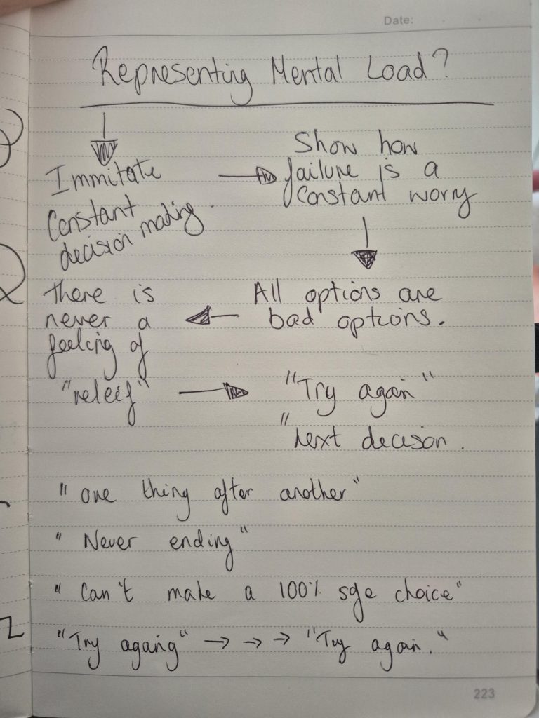
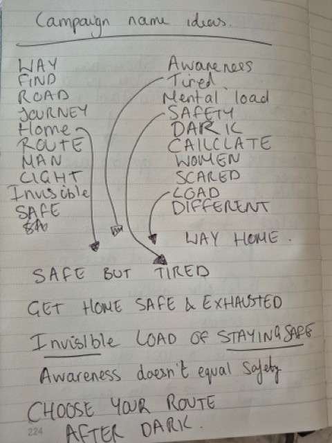
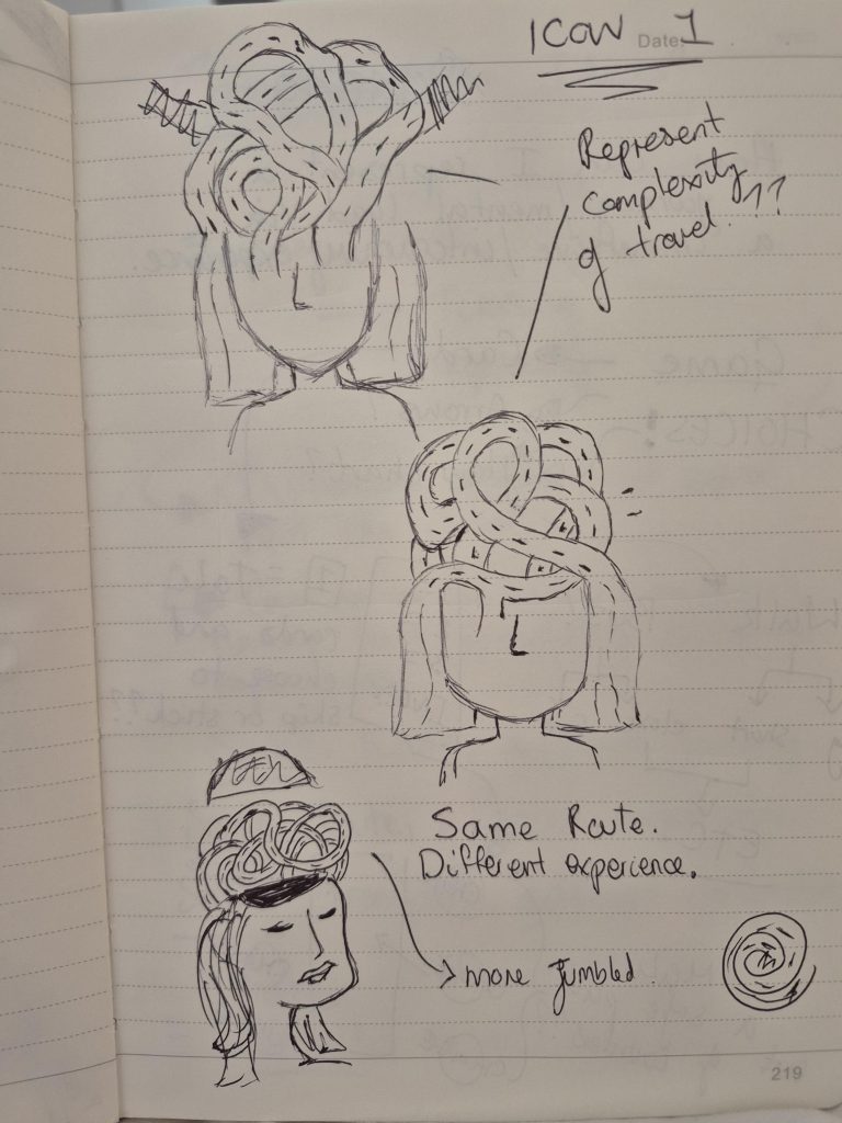
Building on my research, I considered a broad range of conceptual ideas to explore different ways of communicating the mental and emotional load discussed above. I started with sketchbook drawings and brain storms to map out recurring themes within my research. Focusing on repetition, uncertainty, and ongoing decision making.
I specifically stumbled on the idea of “try again” which could imitate:
- No permanent success
- Ongoing vigilance
- Emotional exhaustion
- Cyclical behaviour
- Mental load
Pen to paper brain storms of how I could represent mental load or decision making.
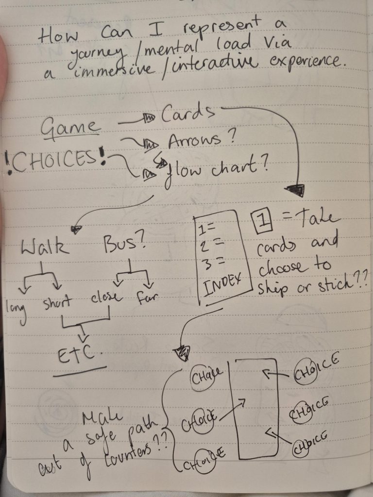
Next I used a Figma board to collect initial thoughts on early concepts. These initial ideas explored a range of approaches including print campaigns, interactive systems, and audience participation. At this stage, I was less focused on aesthetics and more interested in understanding how different formats could influence emotional engagement and audience perception.
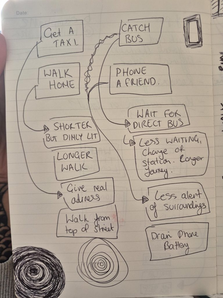
xRather than viewing these communication methods as separate ideas, I began considering how they could work together to create a more immersive campaign. I started with poster sketches to test how interactive activity and print could operate together to creat a larger campaign. This allowed me to start considering user journey, participation, and emotional response alongside visual communication.
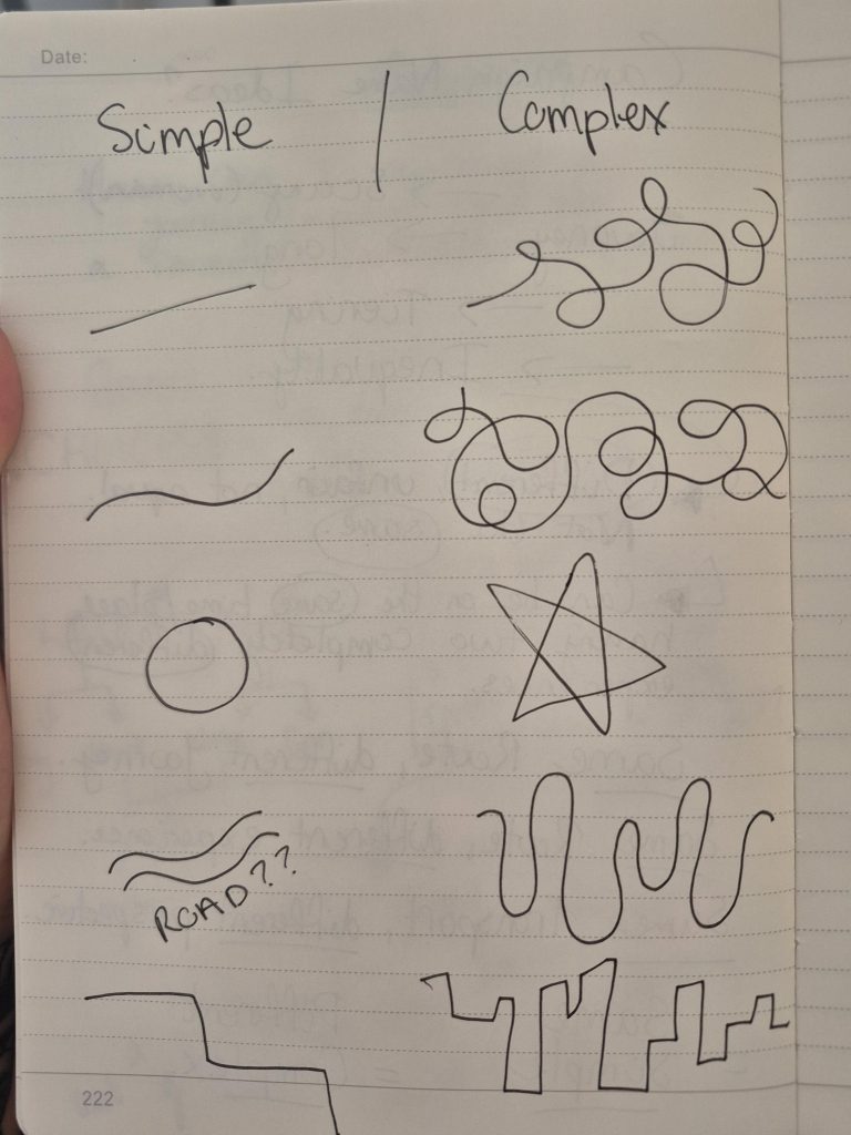
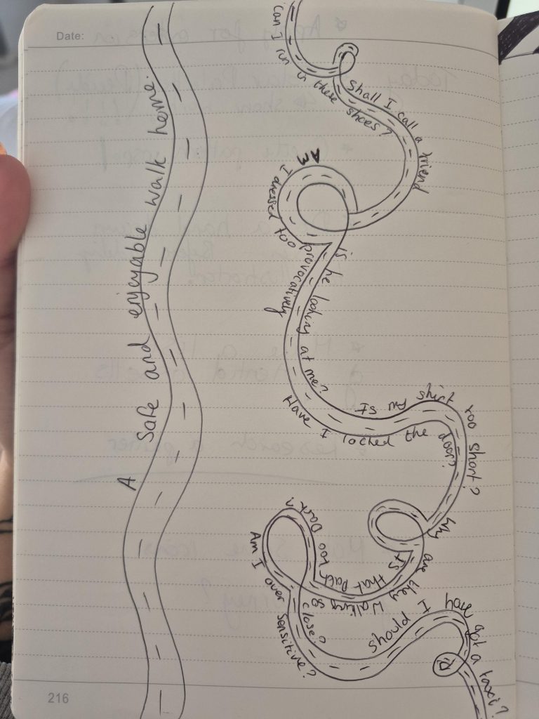
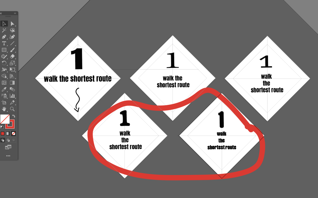
Here on the left I imagined what a simple vs a complex shape may look like, representing a safe easy journey vs vigilance and mental load.
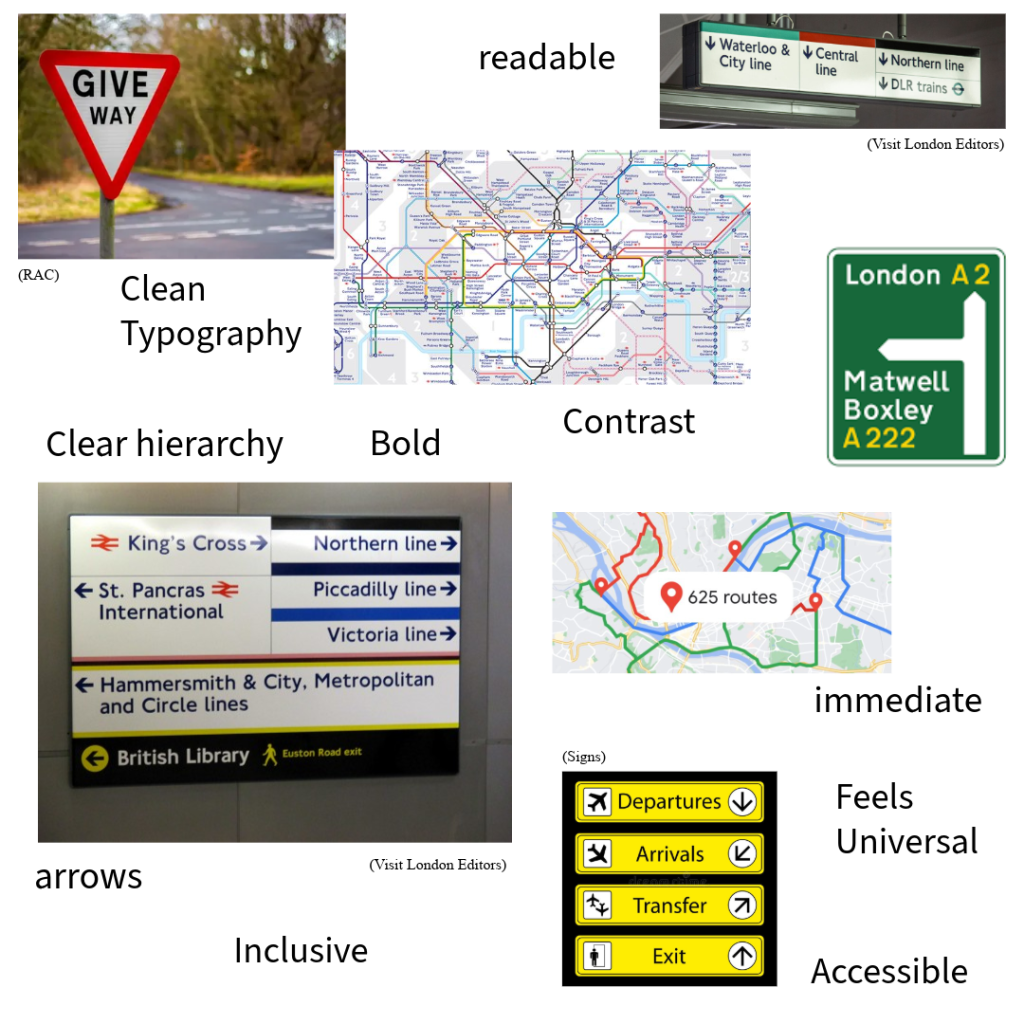
I next made a figjam board of references of how i could use colour / shapes to communicate a friendly and gender inclusive campaign.
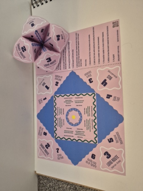
After this research and imagining how I could use the lines and shapes, The fortune teller felt like the strongest direction. As its repetitive structure is based on decision making, plus Its interactive format also shifts the audience from observer to participant, while remaining low-cost, accessible, and easy to reproduce. This could be paired along side a information stand and tactile printed information aimed to get people talking and hands on. I went back to pen to paper for further development.
Campaign Identity
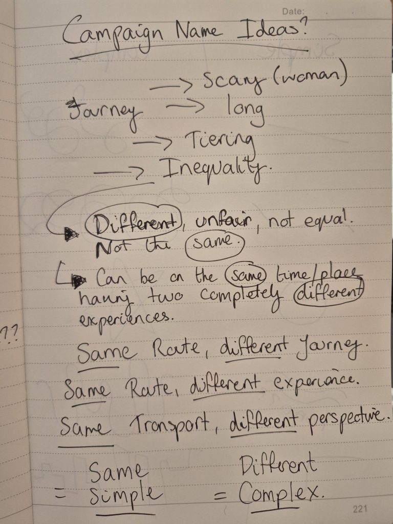
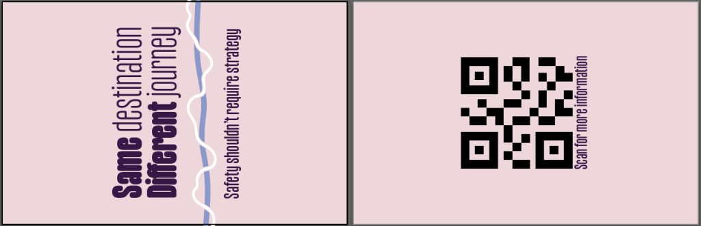
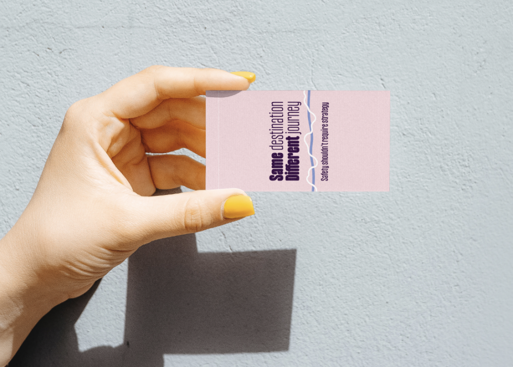
I am leaving scope the change my name / tag line further on depending on feedback, so I will test using “same route” different journey” but this could change as my visual language develops further.
Above : still of first A3 200gsm fortune teller. Right : video of first prototype draft.
This stage helped me move from broad conceptual thinking into a more focused communication system. Considering not only visual outcomes but also accessibility, audience engagement, and material/ suitable size. Next, I will begin digitally refining the fortune teller format, testing how typography, pacing, and interaction can influence audience understanding and emotional response.
Experimentation & Prototyping
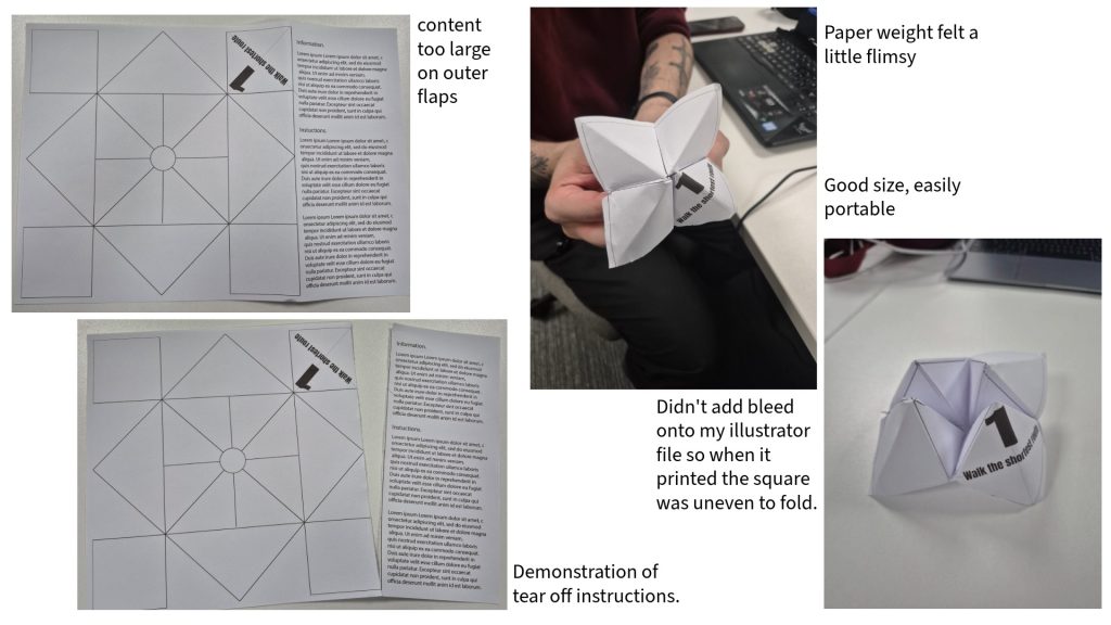
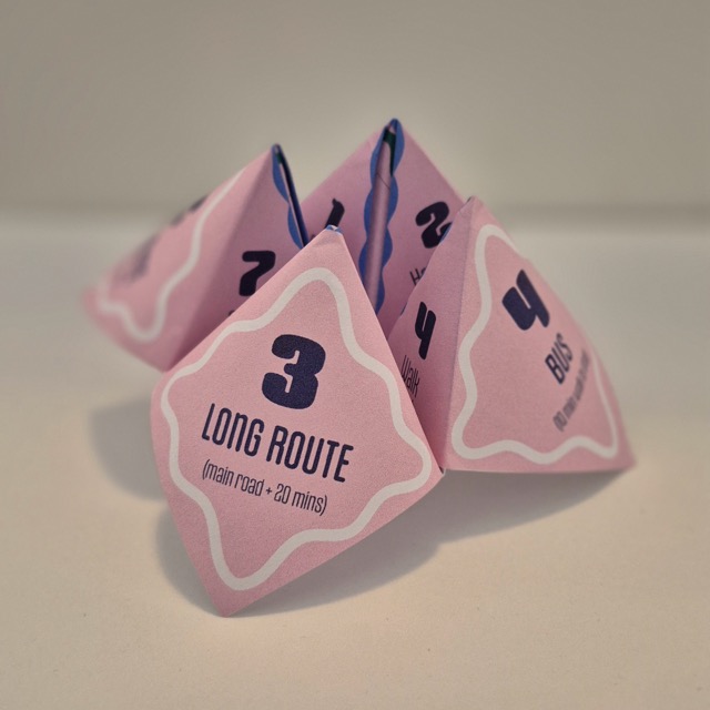
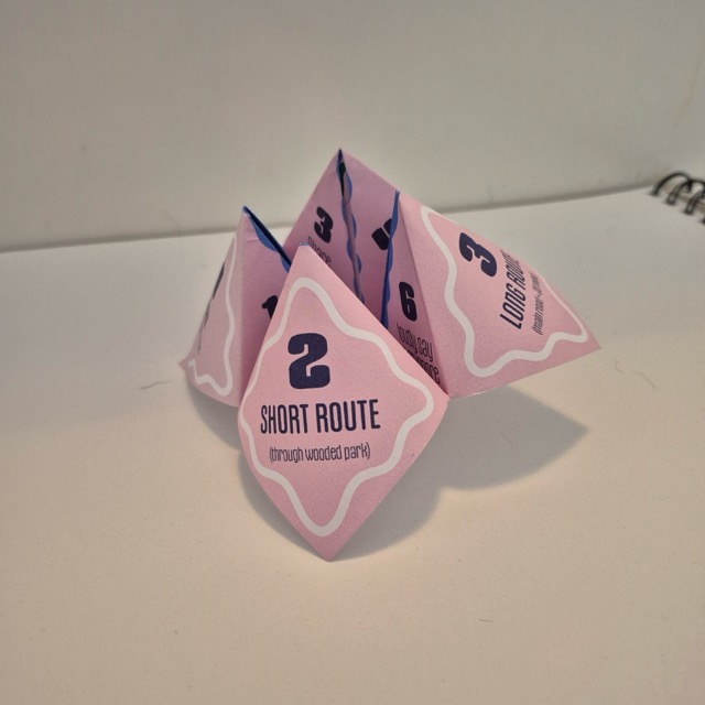
Once I made a fortune teller, I realised the basic starting shape needs to be a square – which gave me the idea of using the empty space to add tear off instructions alongside the fortune teller to increase accessibility and audience participation. It would allow people to create the fortune teller themselves and continue interacting with the project beyond the initial experience potentially increasing reach.
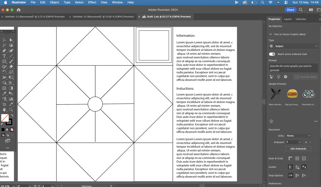
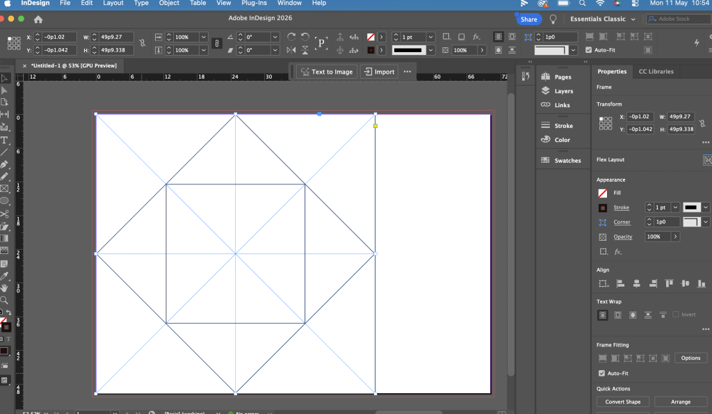
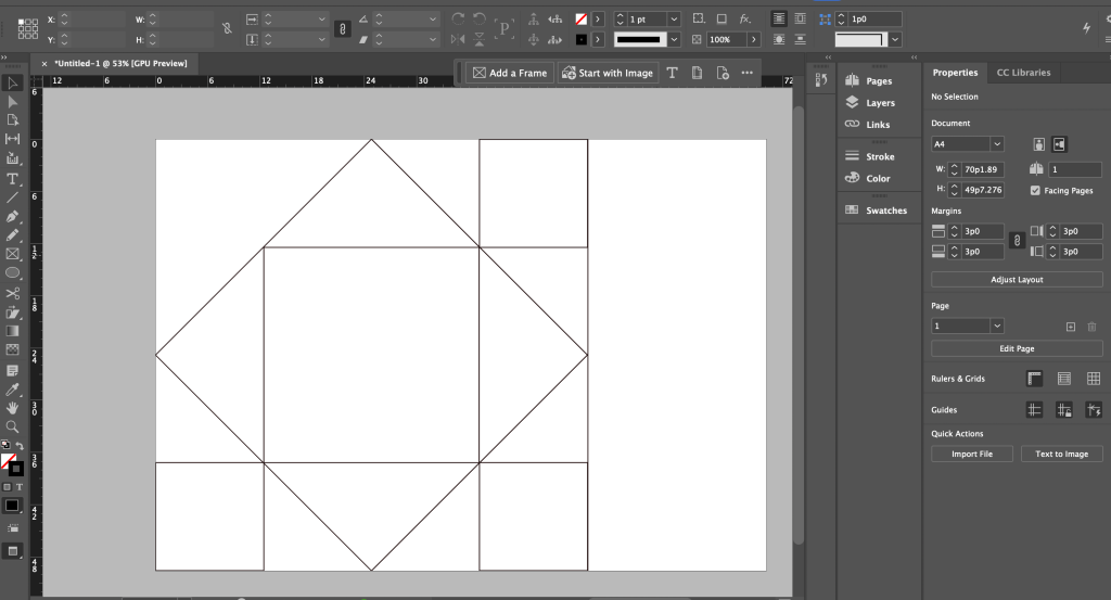
After this experience I decided to re create my basic template on InDesign, at it allows for better accuracy and is more suited for creating print design.
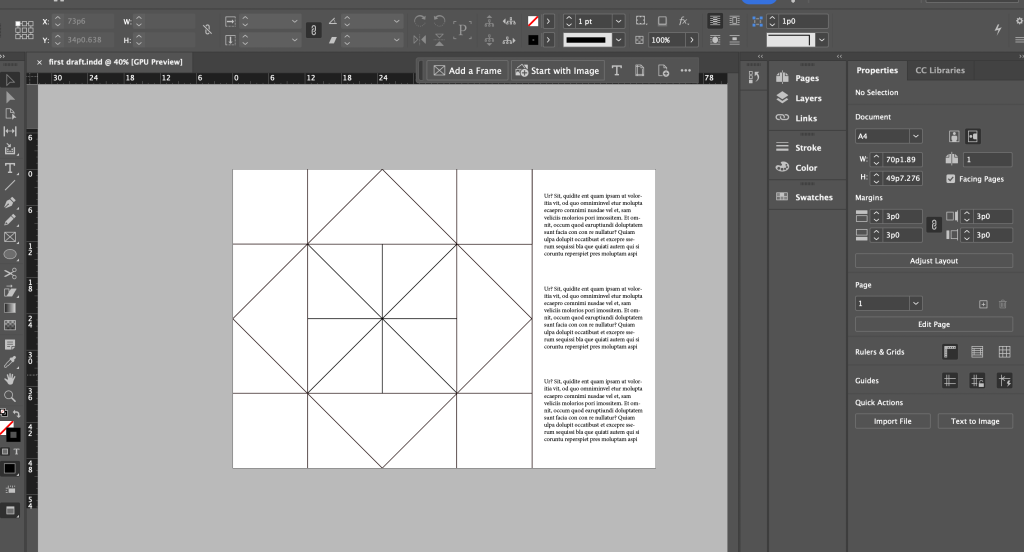
Add photos of in design print / itterations just to prove layout.
Visual Language.
Colour palette Options
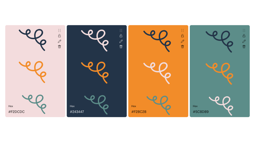
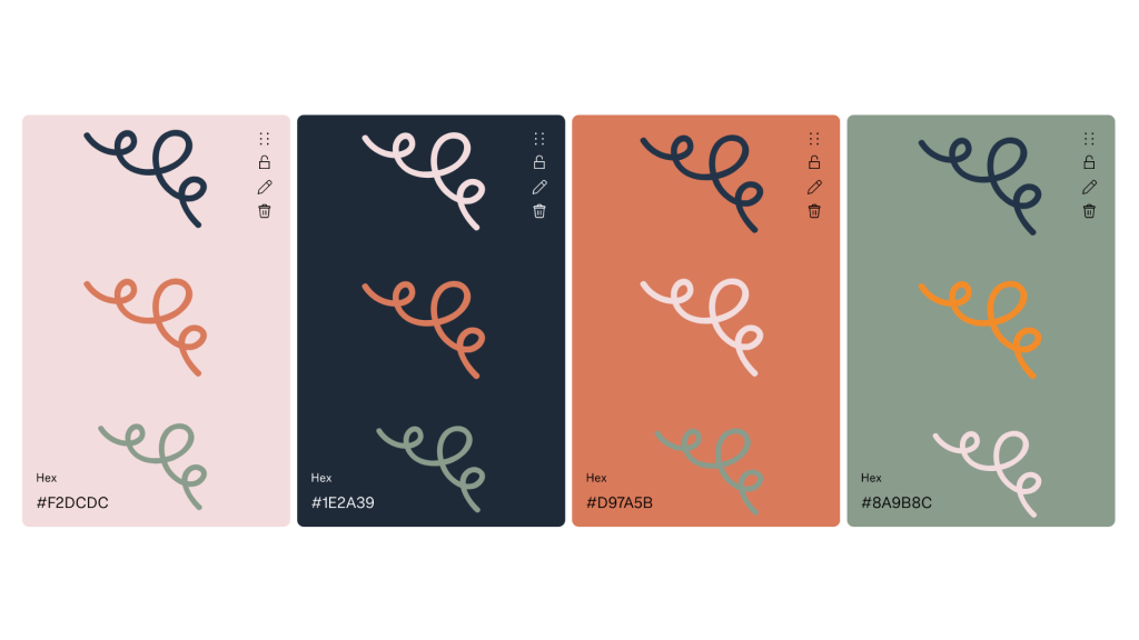
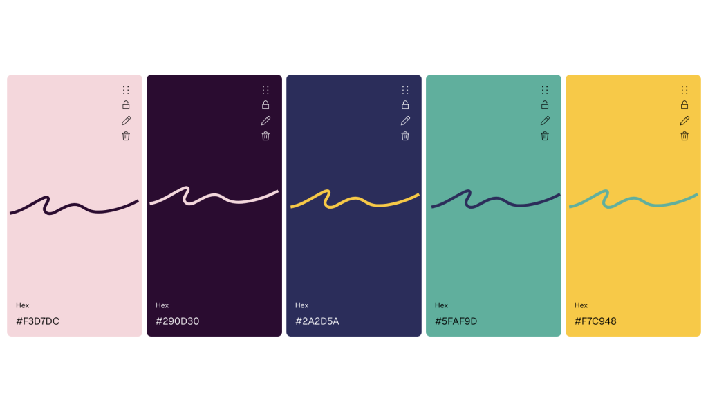
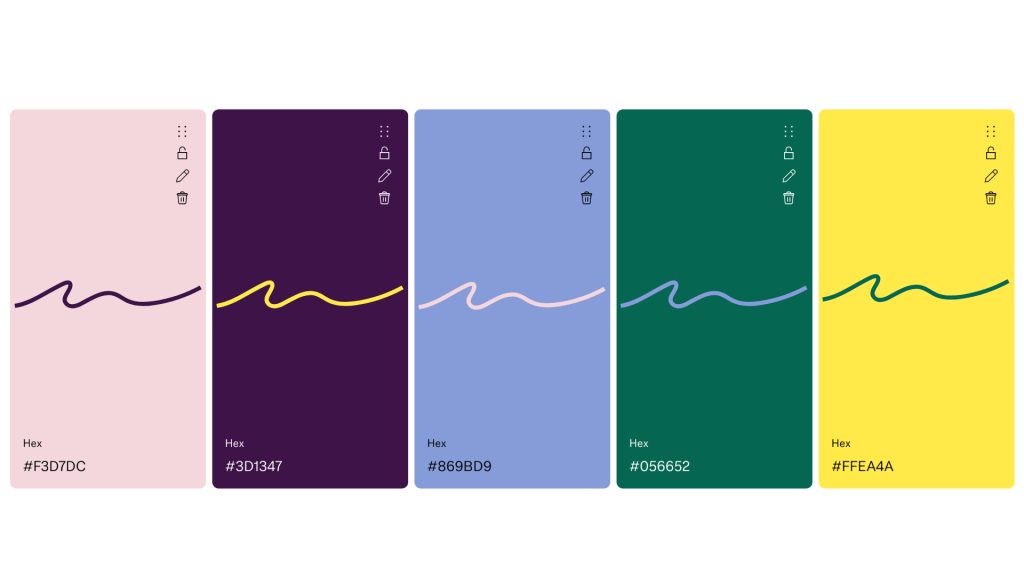
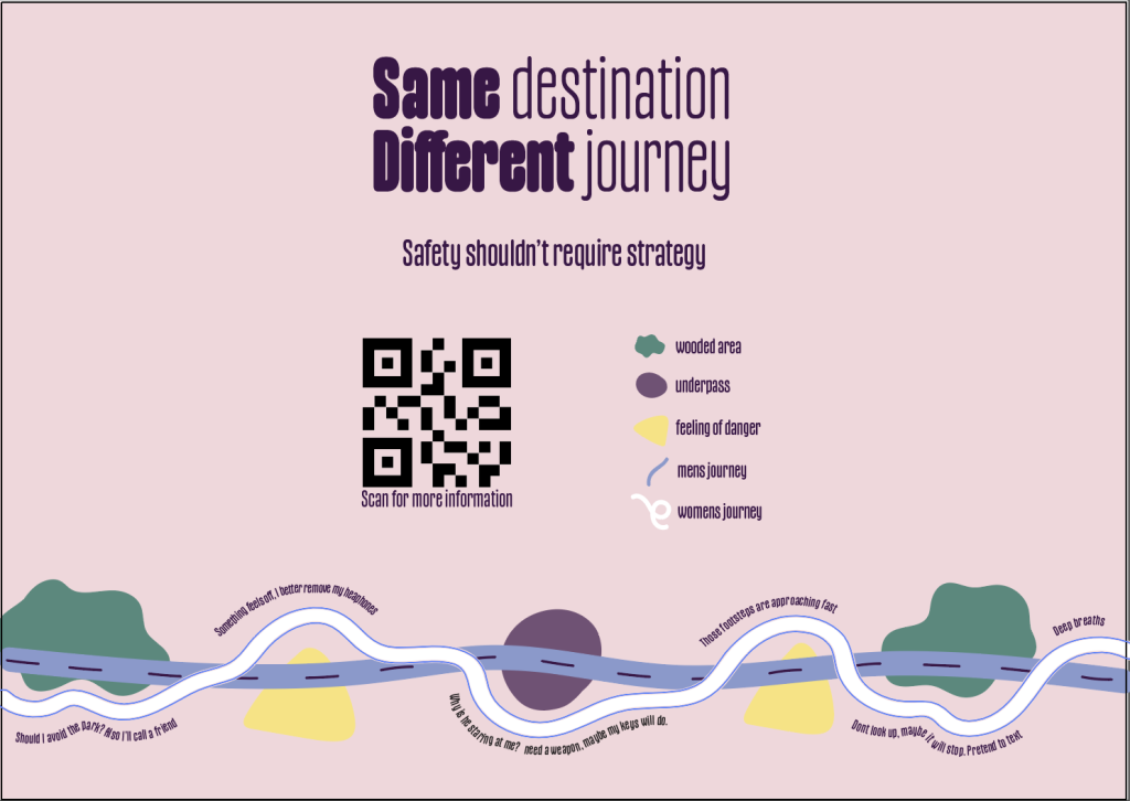
The final palette feels gender neutral, approachable, and accessible, avoiding visuals that immediately communicate danger or fear. Bright yellow and contrasting darker colours subtly reference public signage and navigation systems. Whilst the softer pinks and purple feel inclusive and none confrontational.
Poster Campaign.
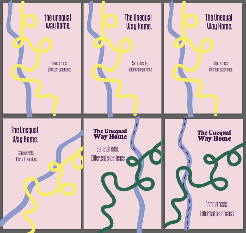
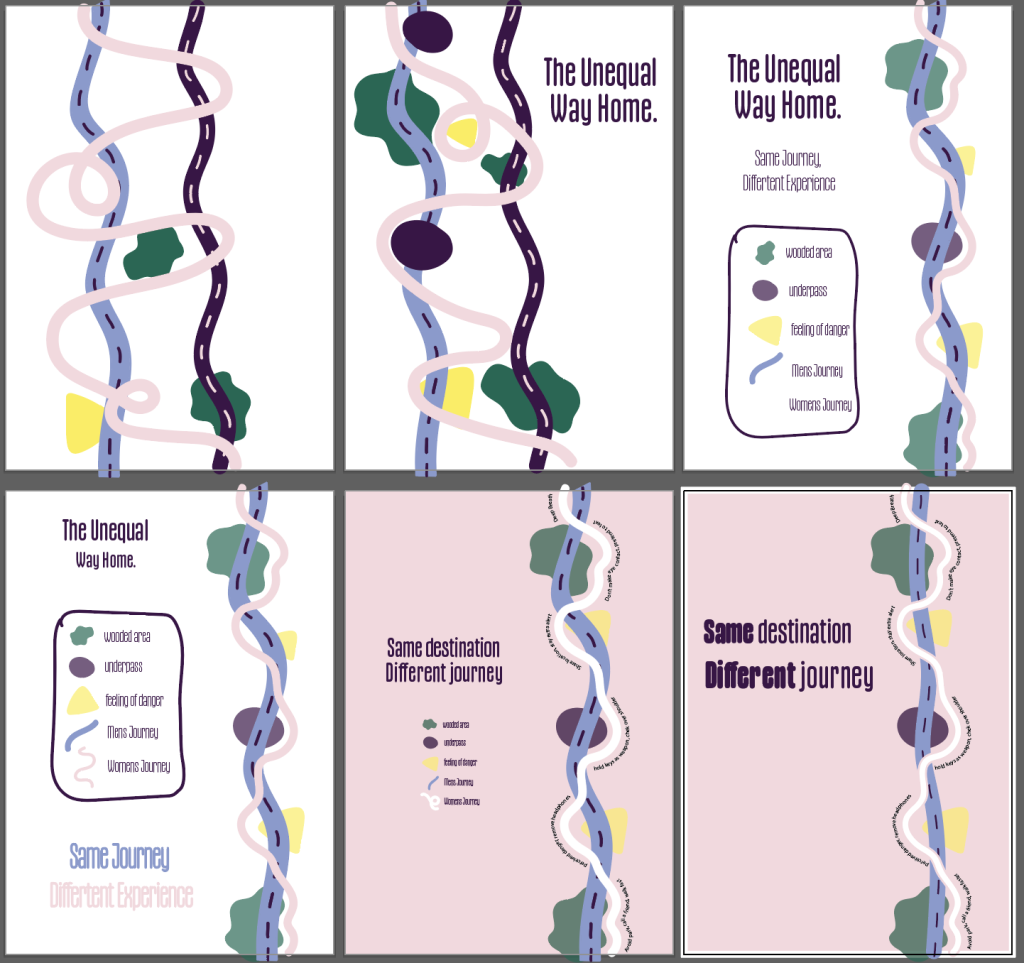
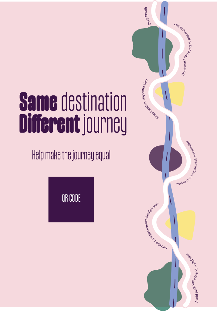
Through refinement, I simplified the design to let the paths communicate the idea. The contrast between a straight and disrupted route reflects the mental load of constant decision-making, while removing excess elements allowed me to trust the viewer to interpret the imbalance themselves.
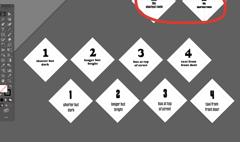
Below – Fortune Teller written content plan draft (With references).
Design Development.
I below I have used a Figma board to show the development of my fortune teller, testing different layouts, colours, and content. I also experimented with paper sizes and materials to see how this affected the interaction and overall feel. This helped me make more informed decisions, keeping the design accessible, easy to reproduce, and focused on the user experience
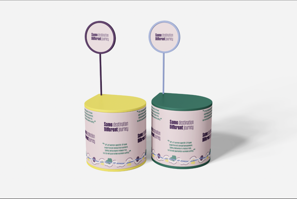
Merch / Freebies
I wanted assets that can integrate into everyday use, extending the campaign in a subtle and accessible way. Familiar, low-cost formats allow the message to be shared and repeated without relying on confrontational communication (whistles, alarms torches etc.)
User Testing and Feedback
Below – PDF versions of feedback sheet, poster and template for user testing.
Outputs
Figma board containing user annotations, testing and questionaire feedback.
Video Showing feedback
Feedback summary
Negative – Clarity was the main issue across both the poster and fortune teller. Some people didn’t fully understand what the symbols represented, and there were also small spelling mistakes and feedback that the text inside was too small to read comfortably. This helped highlight where the design wasn’t communicating as clearly as intended.
Positive – Participants understood the idea of repetition and ongoing decision making, with some suggesting this could be pushed even further. The project was described as engaging and thought provoking without feeling overly confrontational, which aligns with my intention to encourage reflection rather than assign blame. Both men and women also felt the colour palette was inclusive and approachable, helping the work feel accessible.
Informed Design Decisions & Direction
First I created a set of campaign guidelines to ensure consistency going forward throughout my outputs. Defining the tone, visual language, and key messaging. This gave me a fundamental reference point to align my outputs with.
Refined Poster
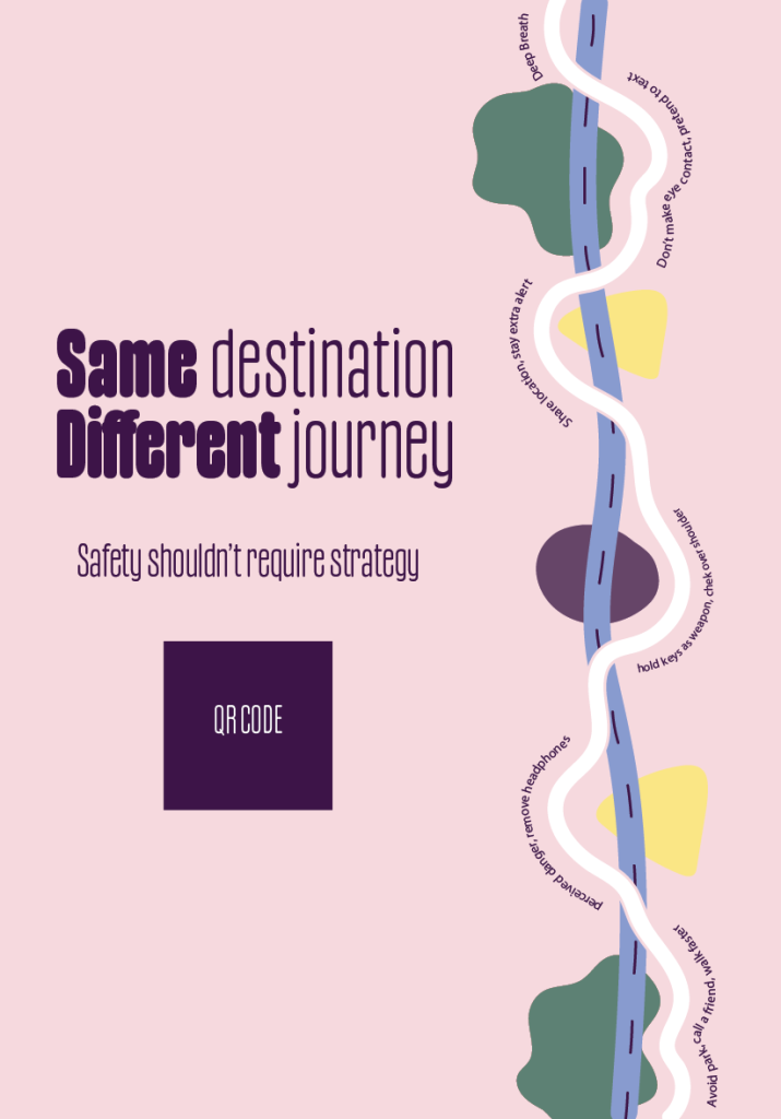
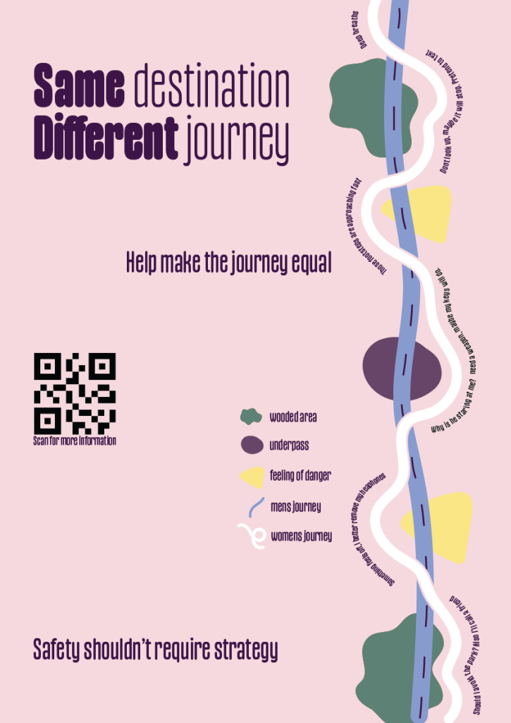
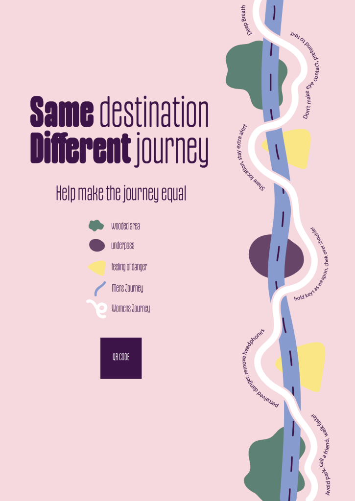
I refined both the visual hierarchy and the language used within my poster to improve clarity and accessibility. I increased text size, added a clearer CTA and a symbol key. I also change the wording along the path to feel less instructional, more immersive. This allowed the concept of mental load to be communicated more clearly.
Refined Fortune teller template.
PDF first outcome
Refined outome
In response to feedback I increased text size, and refined the language to feel more reflective and accessible. This helped create a clearer and more engaging interaction. I also added some polished instructions and the game rules.
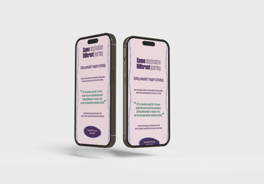
Mobile Landing Page / A6 Flyer / Pocket sized card / Sinage
I carried feedback and campaign guidelines through each stage of development, refining the work to improve clarity, consistency, and overall user experience.
Print outs poster / Fortune teller
Mock Ups.
Throughout the development stage, I refined both the visual language and interactive elements of my campaign in response to ongoing testing and feedback. I explored multiple iterations of layout, colour palette, and typography to ensure the tone remained accessible, non confrontational, and clearly communicated. The poster design evolved to improve hierarchy and readability, while the fortune teller was developed through both digital and physical prototyping to ensure usability when folded. User feedback highlighted key issues around clarity, text size, and instructions, which informed further refinements. As a result, the final outcomes demonstrate a considered balance between visual communication and interaction, effectively supporting the concept of everyday mental load and decision-making.