Historical
When looking at historical examples of design for change, I found myself naturally drawn to bold, graphic posters that combine strong typography with simple but striking imagery.
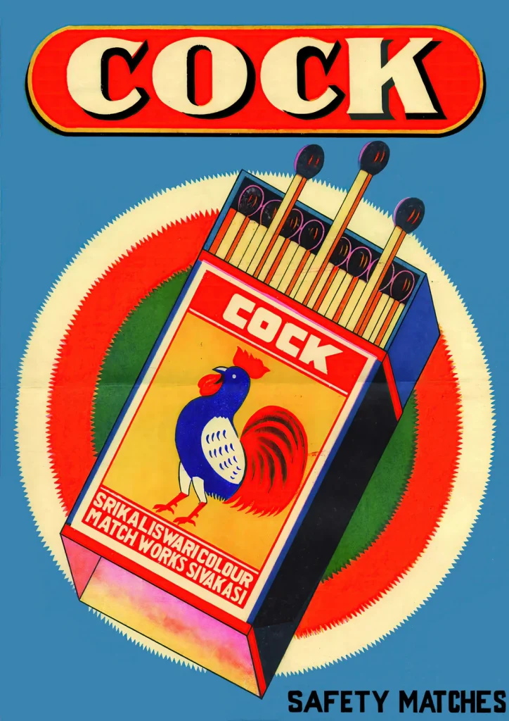
I’ve always been interested in vintage packaging and post-war illustration styles (Like the matchbox design I have included on the right) I wanted to reflect that personal preference within my research.
Instead of focusing purely on minimal or text-based references, I have chosen examples that use colour, hierarchy and clear visual symbols to influence behaviour and also appeal to my personal taste.
Dig For Victory.
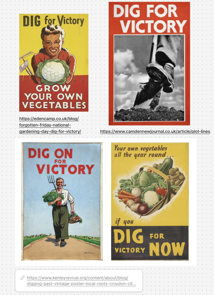
One of the strongest examples of post-war design for change is the British “Dig for Victory” campaign, developed by the Ministry of Agriculture and Fisheries between 1939 -1945 during World War II. These posters encouraged people to grow their own food in gardens and allotments to support the war effort and cope with rationing.
What stands out to me visually is the bold simplicity. The message is direct and commanding, but the imagery softens it by showing thriving vegetables, open land, or happy figures gardening, which makes it feel personal and achievable.
In Dig for Victory, the combination of image and type works clearly and efficiently. The headline does the instructing, while the image reinforces the outcome, something I want to apply in my own project to communicate ideas more clearly and accessibly. I really enjoy how there is very little visual clutter, which makes the message instantly readable from a distance. This reflects the purpose of design during that period, where there was a need to communicate quickly and clearly to a wide audience.
The choice of colour also aligns with these messages. Greens, yellows, and reds symbolise growth, optimism, and urgency. Alongside this, the illustrated figures (often created by artists such as Tom Eckersley (EckersleyCollection) and Dora Batty (Batty) appear purposeful but positive, with upright posture and hopeful expressions that convey resilience rather than fear. By presenting gardening as an empowering and collective act, the posters inspire action through pride and unity, encouraging citizens to feel capable and involved rather than anxious or pressured.
By 1943, over 1.4 million allotments were in use across Britain (Imperial Ware Museum,22) demonstrating the campaign’s success in influencing public behaviour and supporting national food production.
Overall, Dig for Victory demonstrates how combining clear typography with symbolic imagery can encourage large scale behavioural change, especially when communicating to a mass audience. It shows that design does not need to be complex to be powerful; clarity, confidence, and visual strength can be enough to inclusively inspire action.
Contemporary
Forever Against Animal Testing
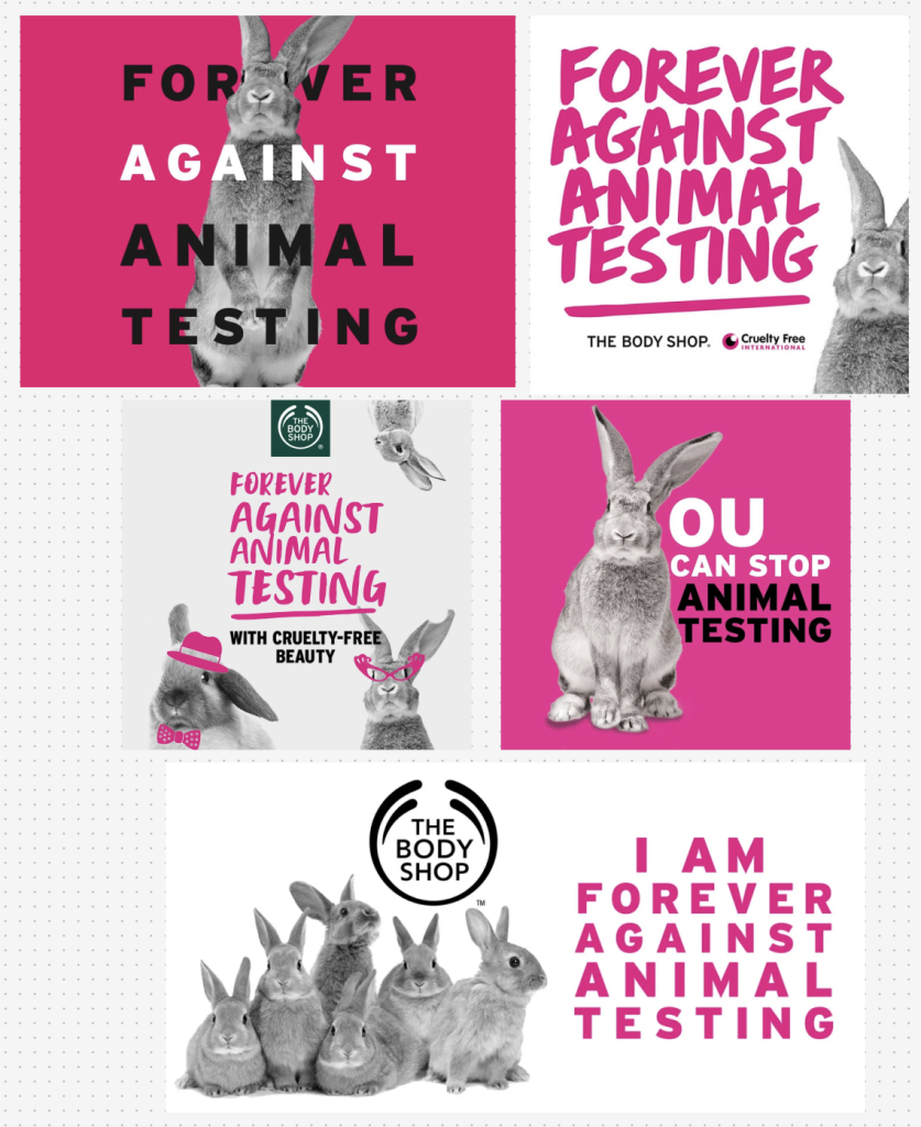
A strong contemporary example of design for change is The Body Shop’s “Forever Against Animal Testing” campaign launched in 2017 in partnership with Cruelty Free International. The campaign aimed to secure a global ban on cosmetic animal testing, using graphic design as a key tool to raise awareness and encourage public participation through petitions and social media engagement.
What makes it particularly effective is its clear and consistent visual identity. Bold typography, high contrast colour palettes, and easily recognisable cruelty free symbols make the message immediately accessible across posters, social media graphics, and in store materials.
Visually, the design is clean and direct. The slogan “Forever Against Animal Testing” is presented in strong, capitalised lettering, ensuring it is unmistakable. Rather than overwhelming audiences with graphic imagery, the campaign prioritises clarity and empowerment.
This campaign stands out compared to others of a similar nature, as the animals remain the key focus, but the imagery is non confrontational. This contrasts with many anti animal testing campaigns that rely on shock tactics to provoke guilt and outrage. By choosing a more approachable tone, the design invites reflection rather than defensiveness, making it suitable for a wider public audience. This is a key theme I want to carry into my own work, focusing on education rather than accusation.
I also appreciate how the simplicity of the layout ensures that the message remains at the forefront. Minimal visual clutter and a strong hierarchy allow the slogan to be understood instantly, making the campaign highly adaptable across both digital and print platforms. This reflects the increasing importance of designing for multiple formats in contemporary design.
Accessibility is central to the campaign’s success. Clear visuals, inclusive language, and straightforward messaging avoid complex statistics or industry jargon, making the content easy to engage with. As a result, the call to action feels achievable rather than overwhelming, encouraging audiences to feel capable of contributing to change.
The campaign’s impact is demonstrated through its global reach, with over 8 million signatures collected (Cruelty Free,19) for its petition to the United Nations, highlighting how graphic design can play a key role in influencing public opinion and supporting real world policy discussions.
Bibliography
Batty, London Transport. “Dora M Batty Posters | London Transport Museum.” London Transport Museum, 22 Aug. 2023, www.ltmuseum.co.uk/collections/stories/design/dora-m-batty-posters.
Cruelty Free. “Cruelty Free International |.” Crueltyfreeinternational.org, 2019, www.crueltyfreeinternational.org/.
Eckersley, Tom. “Tom Eckersley Collection – Digital Collections.” Arts.ac.uk, 2021, digitalcollections.arts.ac.uk/collection/?code=TE.
Imperial Ware Museum. “Dig for Victory.” Imperial War Museums, 2023, www.iwm.org.uk/collections/item/object/27692.