Intro
In a world where so much of our time is shaped by screens, we started thinking about how graphic design could gently encourage people to reconnect with the outdoors. Instead of criticising technology and people’s use of time, we wanted to focus on the positives like fresh air, movement, connection, small moments and making memories that genuinely make people feel better.
Competitor Analysis
Comparing existing initiatives, we found two examples that address social media use and digital overwhelm.
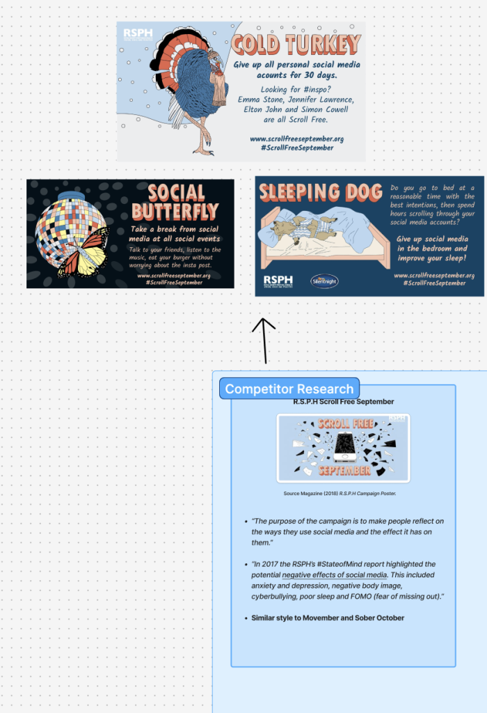
RSPH’s “Scroll Free September”
This campaign encourages users to give up social media for 30 days, positioning it almost like a detox challenge. Visually, the campaign uses bold typography, flat illustration, and direct messaging such as “Cold Turkey” and “Sleeping Dog.” The tone feels quite instructional and awareness driven, focusing on the negative effects of excessive social media use, including anxiety, poor sleep, and FOMO.
While this approach may be effective in raising awareness, it leans heavily on restriction and removal, which can feel slightly confrontational or unrealistic within the context of modern day digital habits. By framing the solution as complete avoidance, the campaign risks alienating audiences who rely on technology in their daily lives, making the behaviour change feel more like a punishment than a positive choice.
Compared to campaigns that promote gradual or positive lifestyle changes, this approach feels less accessible. The messaging is clear, but it does not offer a flexible or achievable alternative, which may limit long term engagement.
This has influenced my own approach, as I aim to avoid overly restrictive or negative messaging. Instead, I want to focus on encouraging reflection and small, manageable changes, using a more inclusive and non-confrontational tone to engage a wider audience.
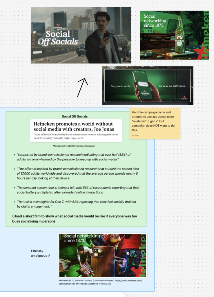
Heineken’s “Social Off Socials”
Heineken’s campaign takes a more ironic and culturally aware approach, using celebrity led advertising to promote real life social interaction over digital engagement. The campaign uses cinematic visuals, humour, and relatable scenarios to suggest that in person connections are more meaningful than time spent on social media.
Visually, the campaign feels polished and engaging, with high production value and a tone that is light and entertaining rather than instructional. This makes it more accessible than more restrictive campaigns, as it encourages behaviour change through suggestion rather than direct instruction.
However, as a brand led campaign, the social message becomes secondary to the promotion of alcohol. While it positions itself as encouraging healthier social habits, it ultimately relies on product association, which raises questions around ethics and authenticity. This could weaken the overall impact, as the message may feel less genuine or more commercially driven.
In addition, the campaign appears more targeted towards a younger, Gen Z audience through its use of humour, pacing, and celebrity culture. This risks alienating older audiences, particularly those within the 30 – 49 age bracket, who may not relate as strongly to the tone or references.
Compared to more inclusive and purpose led campaigns, this approach feels less universal, as it prioritises brand identity over accessibility. This has influenced my own approach, as I aim to create a campaign that feels more neutral and inclusive, avoiding commercial bias and ensuring the message can connect with a wider audience across different age groups.
Joint Figma Board
Target Audience
Our joint campaign, “Stroll Don’t Scroll,” is aimed at 30-49 year olds. Considering a generation that grew up playing outside before smartphones became part of everyday life. Sky and I wanted to tap into a sense of nostalgia and freedom. Focusing on happiness over making people feel guilty or ashamed about their levels of activity.
“Stroll don’t scroll” is rhythmic and memorable, but soft in tone. “Stroll” feels calm and unpressured, suggesting an easy, achievable action rather than a dramatic lifestyle change (eg – couch to 5K).
Visuals
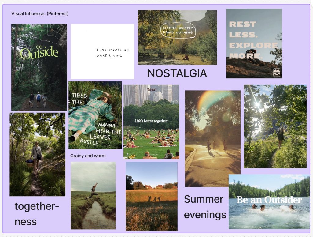
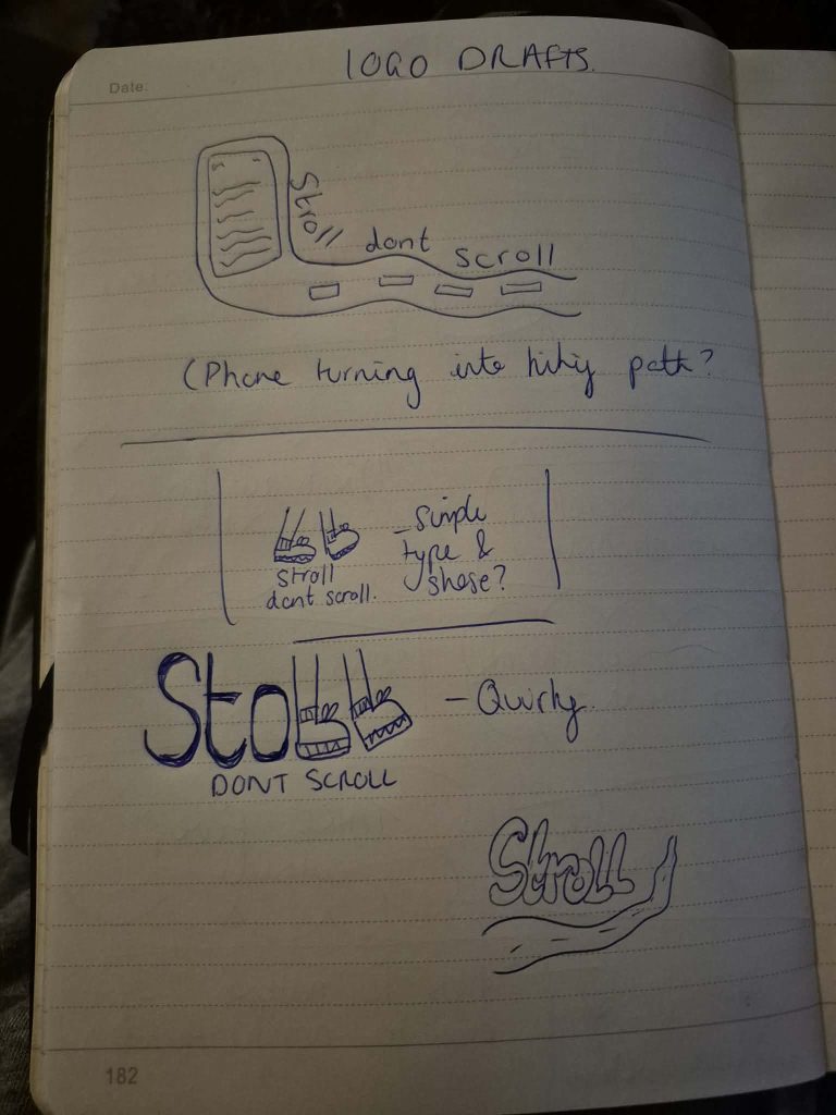
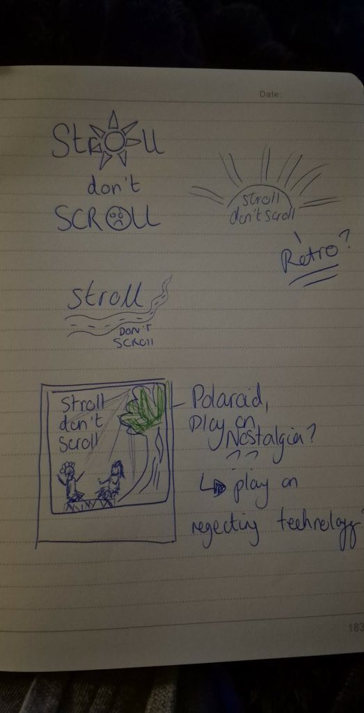
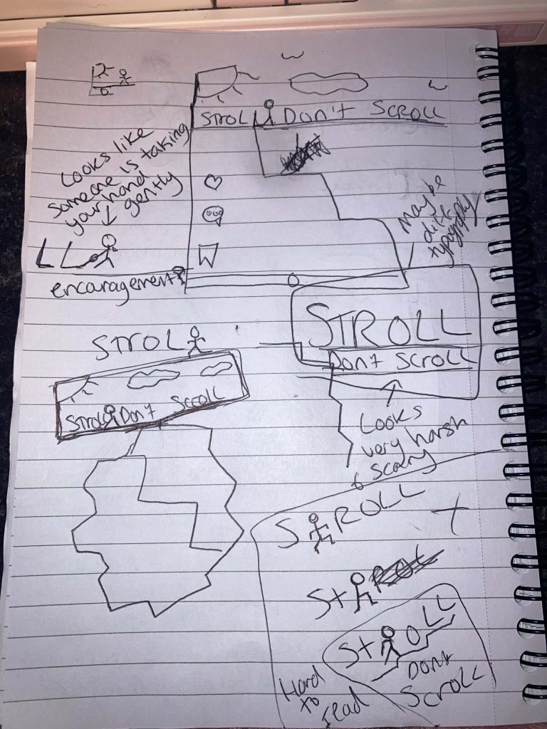
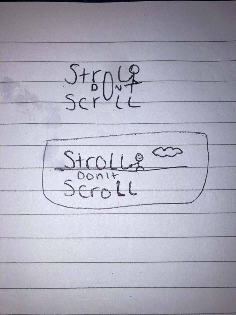
Visually, we have begun exploring early logo drafts, experimenting with rounded typography and subtle path or sunset motifs to reflect warmth and movement. We also created a mood board of inspirational imagery, focusing on golden light, family walks, dog outings and soft, earthy colour palettes such as green, terracotta and light flares. These visual choices help the campaign feel comforting and familiar rather than overly digital or confrontational.
As part of our early development, we created a short draft video exploring the emotional contrast between digital overwhelm and the calm of the outdoors. The concept focuses on the feeling of sensory overload constant noise, pressure and distraction. Before shifting into a quiet, natural setting that evokes relief, clarity and balance.
Although this is still a draft, it helped us explore how strong visual and auditory contrast can highlight the emotional benefits of stepping outside. It reinforced our aim to show outdoor time not as restriction or another “to do” but as a reset and a bridge back to a more stressfree time in peoples life’s when they where younger and technology freer.
Draft Video using (Adobe Stock, 25)
Further Mock up / Drafts using Adobe Stock
I created mockups to show how the campaign would work in real-world settings, helping to communicate interaction, scale, and consistency across different outputs.
Summary
Ultimately, we believe graphic design can encourage positive societal change by shaping how people feel about everyday habits. By making outdoor time feel warm, nostalgic, and achievable, “Stroll, Don’t Scroll” reframes a simple walk as a meaningful reset in a digitally influenced world.