This part of my project focuses on the development of an AR poster system designed to share information about endometriosis in both casual public spaces and professional clinical environments. The posters are not just static pieces of print; they act as trigger images for my AR platform. I carefully consider how scale, language, accessibility, and ethics influence the way sensitive health information should be communicated.
I aim to break down the thinking behind my designs and reflect on how print and AR can work together in a way that feels clear, respectful, diverse, and culturally inclusive. By the end of this project, I aim to produce content that makes the often invisible experience of endometriosis visible, in an accessible and empathetic way that broadens public understanding and supports those affected.
Research.
Medical Posters.
(Pinterest,25)
Consistent Design features.
Throughout these references, I notice that space is used deliberately to create clarity, focus, and emotional impact. Many of the designs employ generous negative space, allowing key imagery to stand out without overwhelming the viewer. Designers also use scale, shape, and colour to establish visual hierarchy, gently guiding the audience on where and when to look.
This approach creates a calm yet impactful tone that feels informative while remaining soft and approachable. It also ensures that essential information is clearly presented before a user engages with the AR experience.
Illustration also plays a central role across the mood board, with lots of symbolic and friendly feeling visuals – rather than literal or graphic anatomical representation.
Many of the illustrations use flowing forms, abstract shapes, and textured elements that reference the human body without directly depicting medical imagery. This approach helps depict clinical subjects in a respectful, accessible and inclusive manner.
It is clear to me that the designers of these posters have considered the sensitive subject natures of these posters, and how they can make a serious subject matter a little easier to digest through thoughtful and sensitive choices in content.
Trigger Image Design Considerations
As my trigger will be print, I will use static image tracking over motion and sound. Research shows that AR systems can increase mental workload and reduce task performance when visual or interaction complexity is high. Which could alienate medical staff from using the platform, (Jeffri&Awang Rambli,21) By reducing cognitive load I increase accessibility.
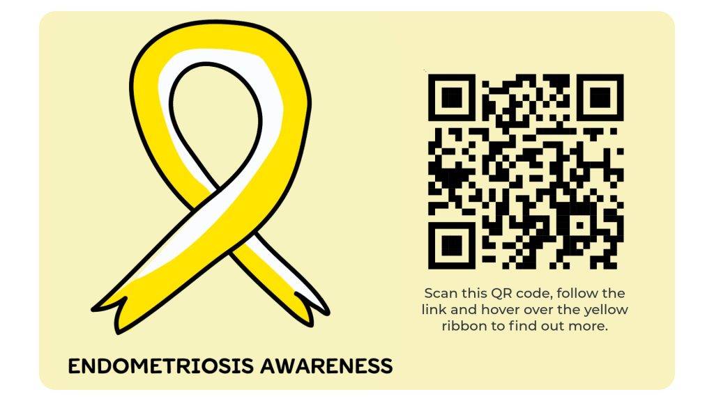
I am doing to explore whether the AR experience should be activated using a full poster design or a smaller trigger symbol that can be included as an element of a poster but also be used as a standalone piece of print design, eg – stickers or wallet sized cards.
Poster
Pros: Using a full poster as the trigger image clearly introduces the topic before interaction. It sets the tone, provides context, and helps guide the viewer’s expectations, while the detailed visuals also improve AR recognition and tracking.
Cons: Posters are limited to specific locations and formats, which makes wider distribution harder. The larger amount of text or information may also feel overwhelming for some viewers who prefer a simpler visual cue.
Stand Alone Trigger
Pros: A smaller symbol based trigger with a clear CTA like “Scan Me” provides an intuitive entry point into AR. It can be reused across stickers, flyers, posters, and other marketing without requiring new programming, and also works as a consistent visual identity for the AR experience.
Cons: To function reliably as a trigger, the symbol must still have enough contrast, texture, and asymmetry, which can limit how minimal or flexible the design can be across different materials.
Colour Exploration and Connotations.
In developing the visual identity for the poster and AR trigger, I am carefully considering the cultural and ethical implications of colour use in relation to female and non/reproductive health. Rather than relying on traditionally gendered colour associations such as pink, I am exploring deeper, more grounded tones that communicate seriousness, strength, and chronic impact.
This approach supports inclusivity for trans men and non-binary people who are also affected by endometriosis, while avoiding language that may stereotype the condition. Colour is used to express experience and embodiment rather than gender, allowing the project to remain empathetic, accessible, and respectful across diverse audiences.
Mood Board of words I used to anchor my colour pallet. (pinterest,25)
I want the colour palette for this project to be guided by a set of embodied values that reflect both the lived experience of endometriosis and the aims of the content I am making on the viewer.
These values are not purely aesthetic; they consider ethical, inclusive, and emotionally appropriate design decisions.
Conveyance of healing and support should prioritised in order to help reassure patients who have faced frequent dismissal or misunderstanding, communicating safety and validation rather than urgency or alarm. Hopefully encouraging further exploration into the AR platform, as this is the overall goal of the print work I am creating.
Deeper, desaturated tones such as burgundy and muted reds can be used to reference the body and chronic pain without relying on literal representation, and supporting the communication of resilience, Unlike bright or saturated reds, that could be cause alarm or hint too closely to blood. Allowing the Endo to be treated with gravity and respect rather than urgency or shock.
Natural colours provide visual balance and clarity, supporting accessibility while avoiding traditionally gendered colour associations. My palette should create a sense of shared understanding that is not tied to gender or cultural stigma.
Possible Palettes.
Below I have made some palette options using illustrator, along with the colour meanings to see how they sit together and if they evoke the meanings I would like.
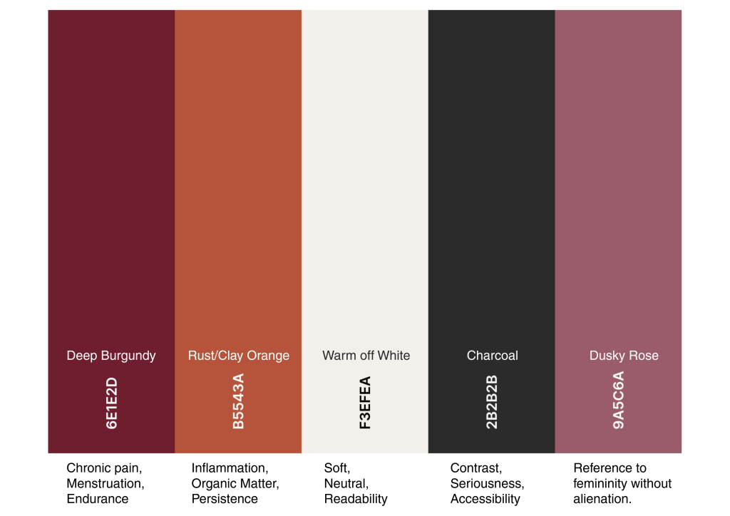
This palette focuses on pain, resilience, and the body, without leaning into gendered aesthetics.
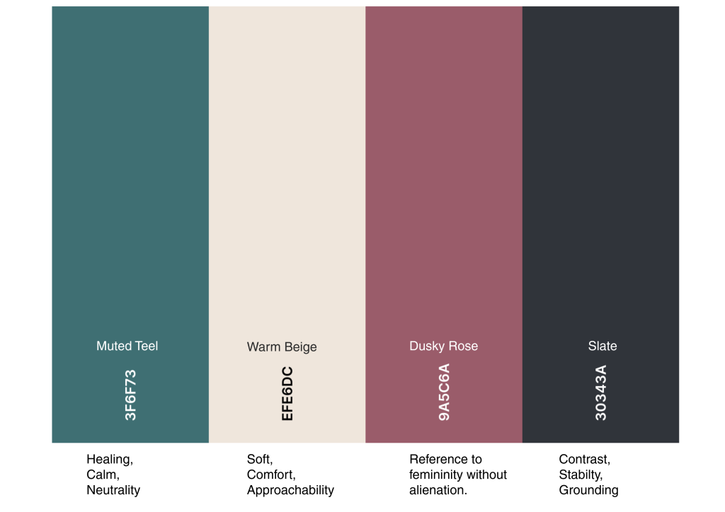
I feel this balances empathy, calmness and pain, without slipping into “wellness” aesthetics.
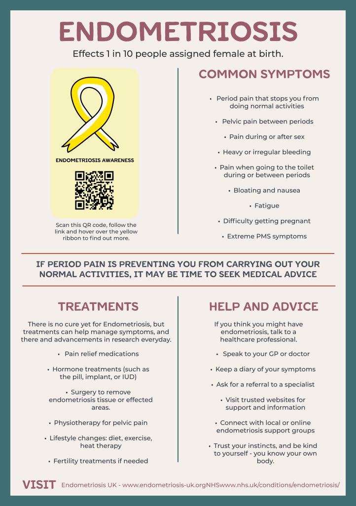
Poster Content and Information Reliability
The poster will be designed designed with focus on accuracy, ethics, and accessibility. As the poster functions as a first point of contact, it is important that all information presented is reliable and responsibly communicated. Research informing the project is drawn from established health organisations and medical authorities, including
- Endometriosis UK. (Endometriosis UK,19)
- The NHS , Endometriosis. (National Health Service,22)
- The World Health Organisation, Endometriosis. (World Health Organization,15)
- National institute of health and care excellence, Diagnosis and Management. ((NICE,17)
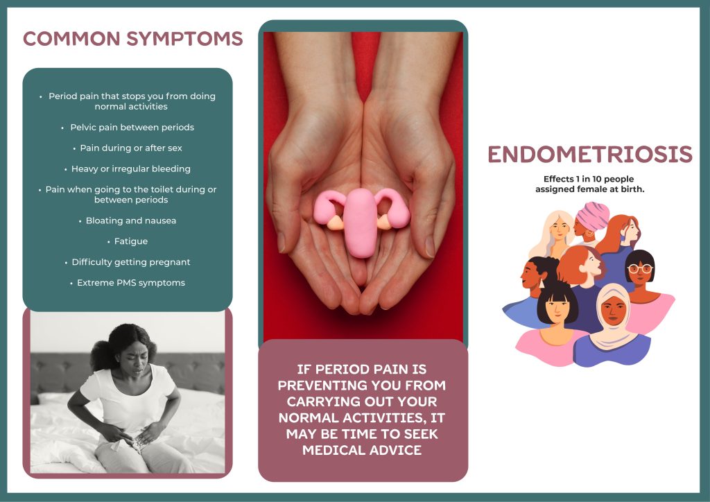
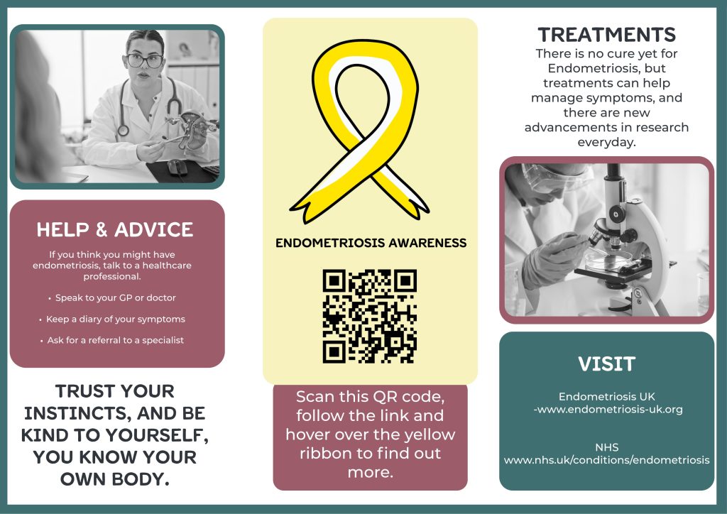
In terms of content, I am focusing on key areas such as common symptoms, how experiences can vary from person to person, the challenges around diagnosis, and current treatment options. Symptoms are approached carefully to reflect both their range and severity, while avoiding language or imagery that could feel distressing in public spaces. Treatment information is kept broad, recognising that there is no single solution and that managing endometriosis looks different for each individual.
Type Face
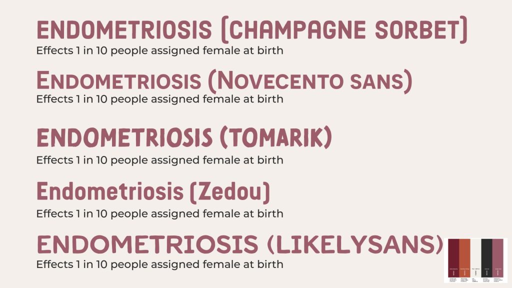
I have tested a range of typefaces from Adobe Fonts to find a balance between readability, accessibility, and emotional tone. The typefaces I am exploring all fall into the sans-serif category, which is widely recognised for its clarity and legibility, WCAG recommends the use of sans-serif fonts for improved readability in informational materials. (WCAG,24)
I feel The tested fonts offer variations in weight and shape, also supporting clear communication while still feeling warm and approachable, which aligns with the project’s intention to be informative without causing distress.
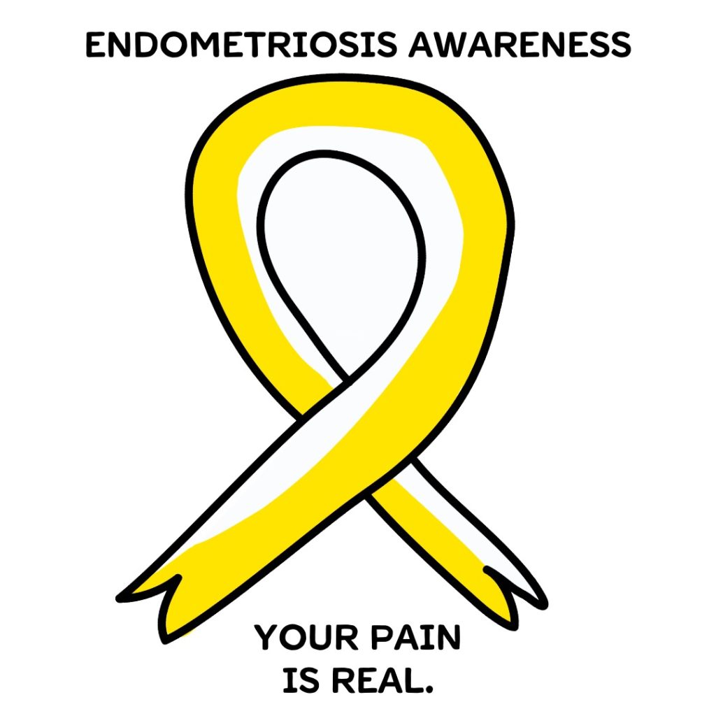
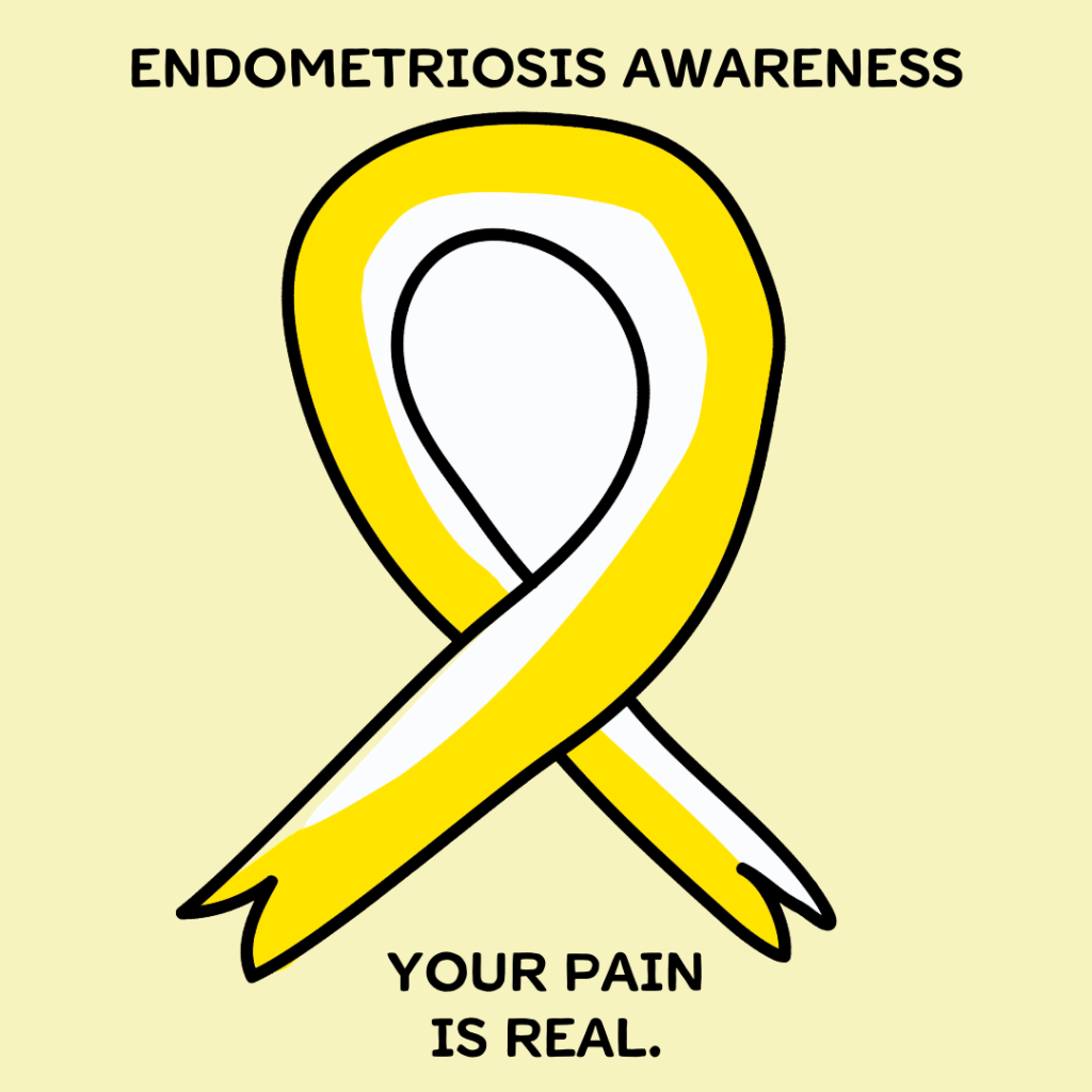
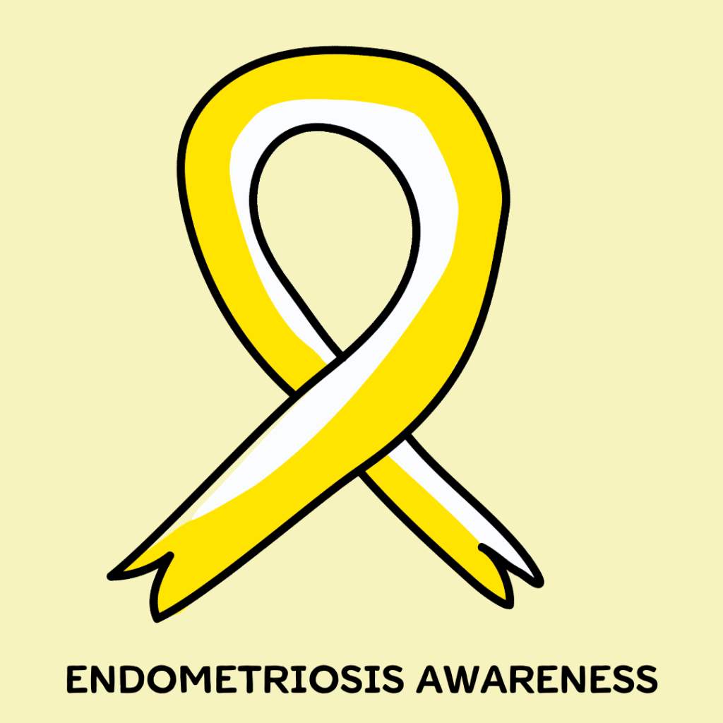
Poster Drafts.
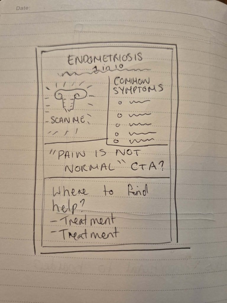
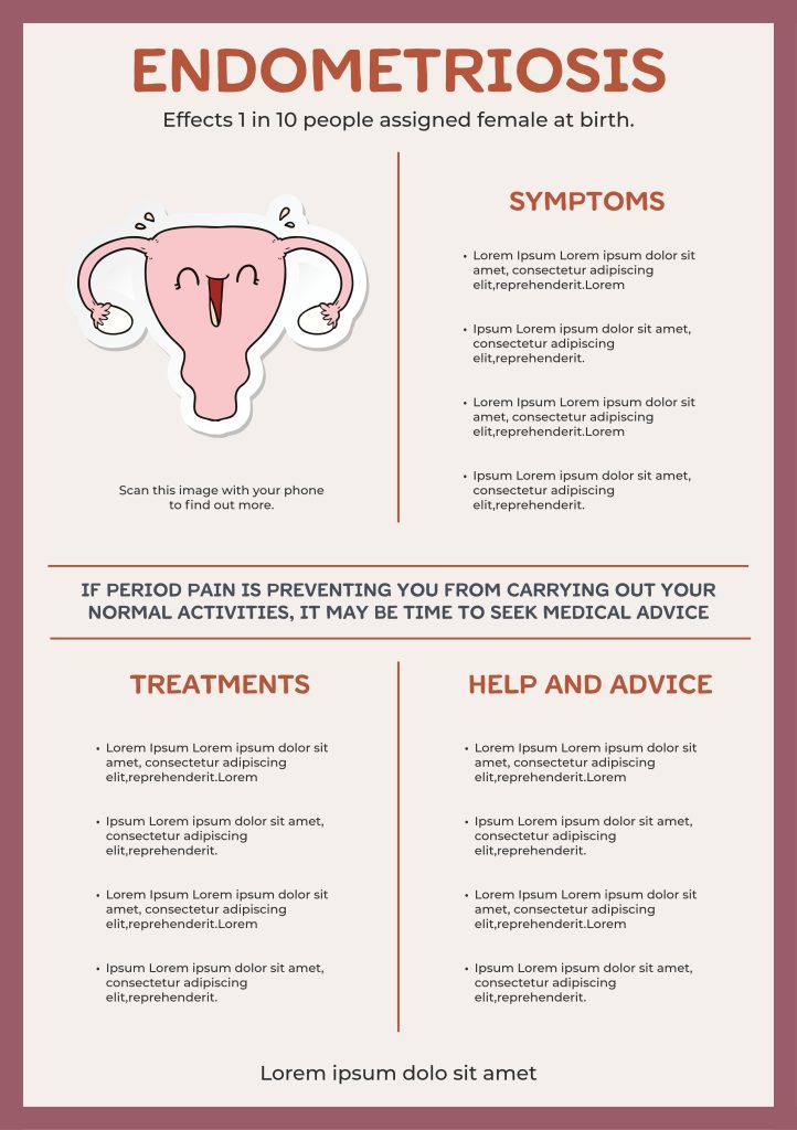
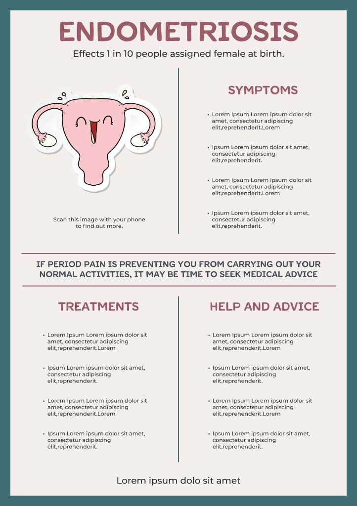
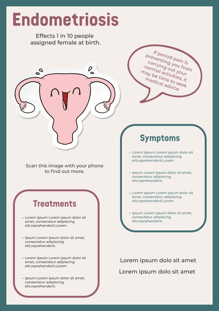
After testing different colour combinations, layout and typeface, At this stage Poster 1 stands out to me as the most suitable direction. Its structured layout and balanced colour palette supports readability and accessibility. It also feels approachable, whilst still aligning with the seriousness of the subject matter. I will develop it further as I decide what content to include and develop the details of my AR trigger.
Reflect on future trends and possibilities within emerging technologies.
Image Target Ideas.
Mood Board of none anatomical or literal images I can use to inspire me.(pinterest,25)
At this stage of the project, I am exploring symbolic approaches for the AR target image rather than relying on literal anatomical imagery. A womb would be obvious idea, but it feels predictable and may be less- inclusive than some kind of awareness based symbol like in the collection above. Exploring non-anatomical options allows for inclusivity, ethical sensitivity, and accessibility.
I decided that a mention of pain may be too intense for someone seeking a diagnosis, and I dont want to make it scary so I removed it.
I used a mixture of my recourses, (Endometriosis UK,19) (National Health Service,22) (World Health Organization,15) to add information to my poster, just basic information as the Emerging Tech skills are my main focus through this project.
Bibliography.
Endometriosis UK. “Endometriosis UK | the Leading UK Charity That Supports Women Living with Endometriosis.” Endometriosis-Uk.org, 2019, www.endometriosis-uk.org/.
National Health Service. “Endometriosis.” NHS, 5 Sept. 2022, www.nhs.uk/conditions/endometriosis/.
NICE. “Overview | Endometriosis: Diagnosis and Management | Guidance | NICE.” Nice.org.uk, NICE, 6 Sept. 2017, www.nice.org.uk/guidance/ng73.
Pinterest. “Medical Posters on Pinterest.” Pinterest, 2 Jan. 2026, uk.pinterest.com/kateh0782/medical-posters/. Accessed 2 Jan. 2026.
WCAG. “How to Meet WCAG (Quickref Reference).” W3.org, 2024, www.w3.org/WAI/WCAG22/quickref/?versions=2.1#resize-text.
World Health Organisation. “Endometriosis.” World Health Organization, World Health Organization, 2023, www.who.int/news-room/fact-sheets/detail/endometriosis.