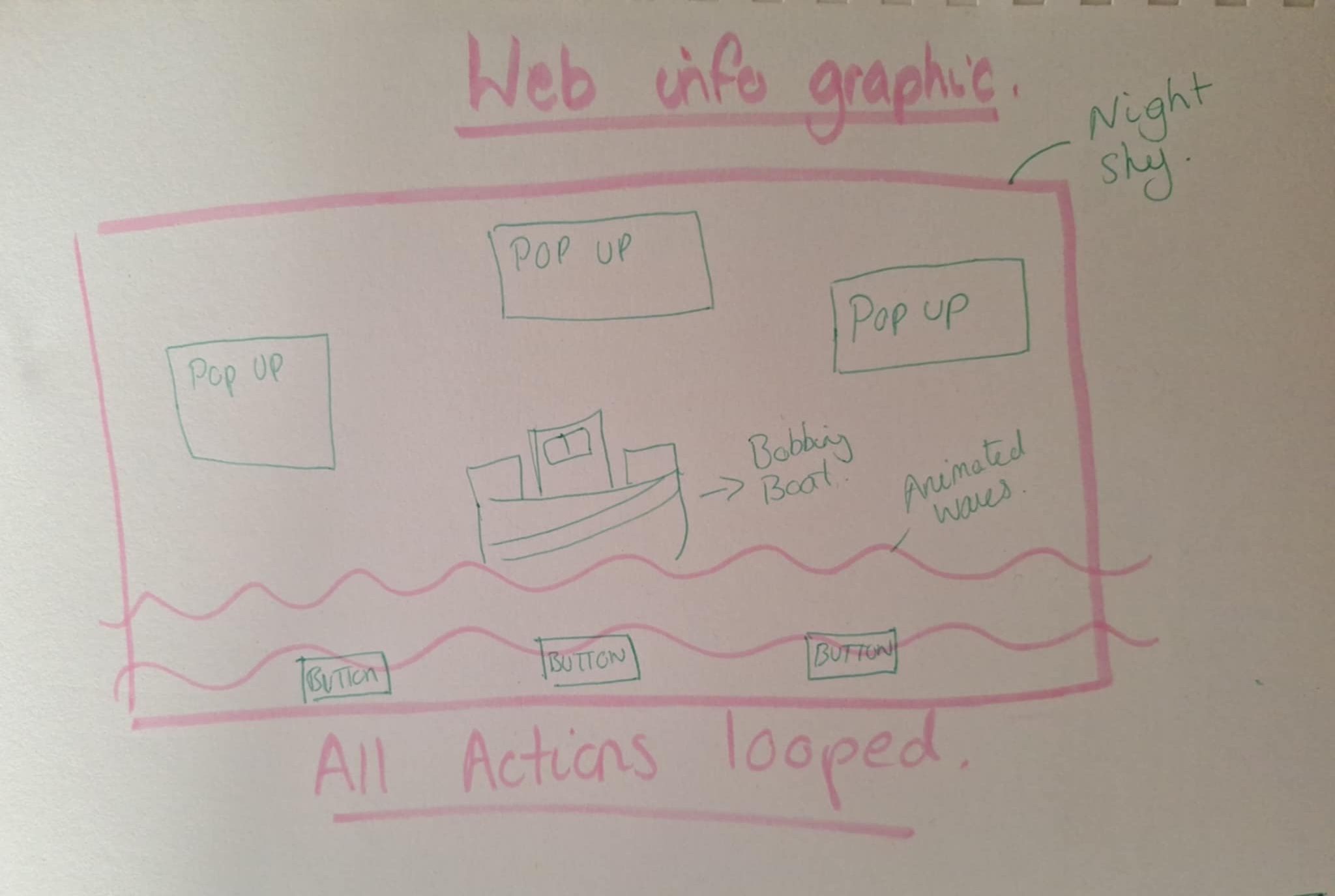
For this second page, I want to expand on the brand identity established in the animated landing page by creating a visually engaging screen. My goal is to maintain the same aesthetic, but showing the venue from a different angle. To do this I have decided to use a night-time theme.
“What would a new visitor want to know about Sound Buoy?” – was my starting point. To consider the very basic information without adding too much text, as the screen needs to be inclusive and accessible so making it clear and concise will aid this.
I will also consider Hierarchy, Buttons should stand out, titles should be larger than body text, and buttons should stand out and reflect clearly their purpose on the screen.
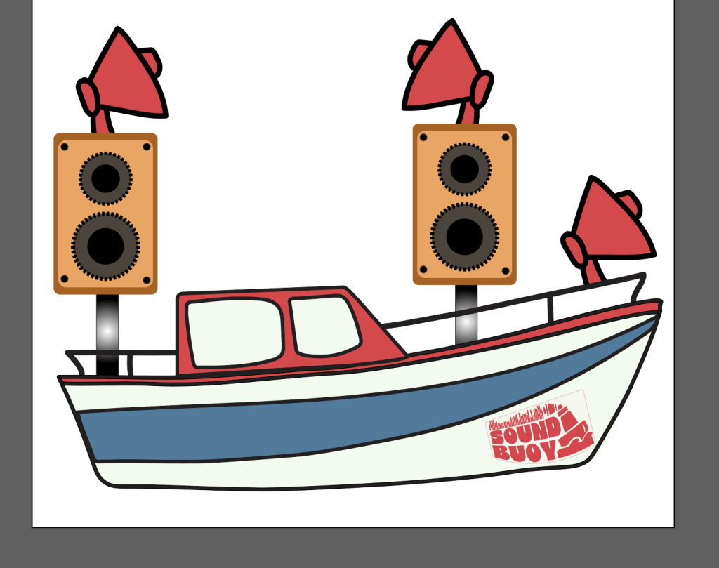
To do this i will re-use some of my assets from my previous landing page, but also introduce some new elements to make it clear that this page has a different function.
Assets.
Simple chart to show interactivity flow, using figma.
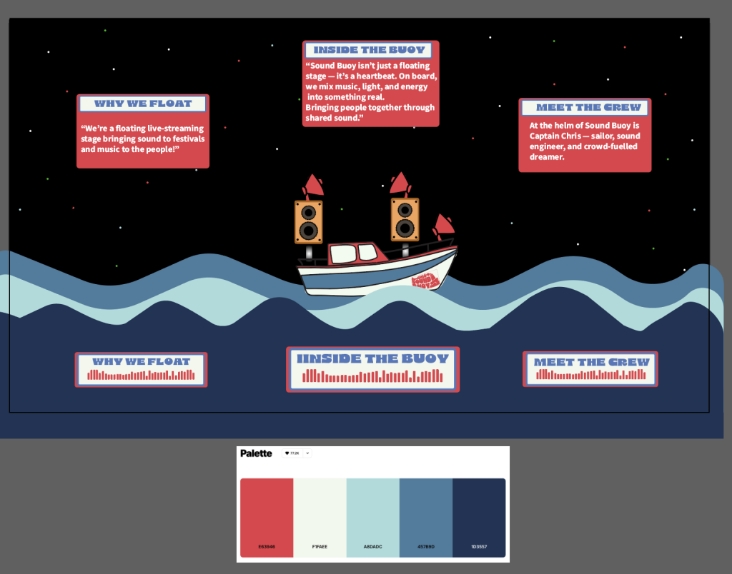
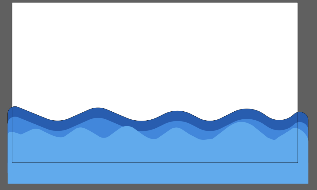
I have changed the waves to be darker to reflect night time, and also to be in keeping with the branding colour palette. To add some more pops of colour on the dark background, and to draw attention to the buttons I added some red also.
First Web Based Info Graphic (screen recording)
This is my first infographic where I just edited my buttons and pop ups. Then I wanted to add some movement to my waves and my boat, but keeping it calm as it is a night time scene.
Infographic2 with added shape tweens.
This infographic page is all about showing what makes Sound Buoy special – not just the venue, but the heart behind it. From the crew to the mission, each button gives a little glimpse into the vibe Sound Buoy aims to create. I think It’s fun, interactive, casual and keeps the energy of the brand flowing.