This blog post outlines the process and design thinking behind an animated mobile advert created for SoundBuoy. The advert features animated text and a button, designed for mobile screens, to attract music lovers and festival-goers, particularly under the genre of Jungle Music.
Considerations
- Load time and responsiveness.
- Clear call-to-action
- Legibility of text – on small screen.
- Visual impact within 15-30seconds.
- Brand consistency.
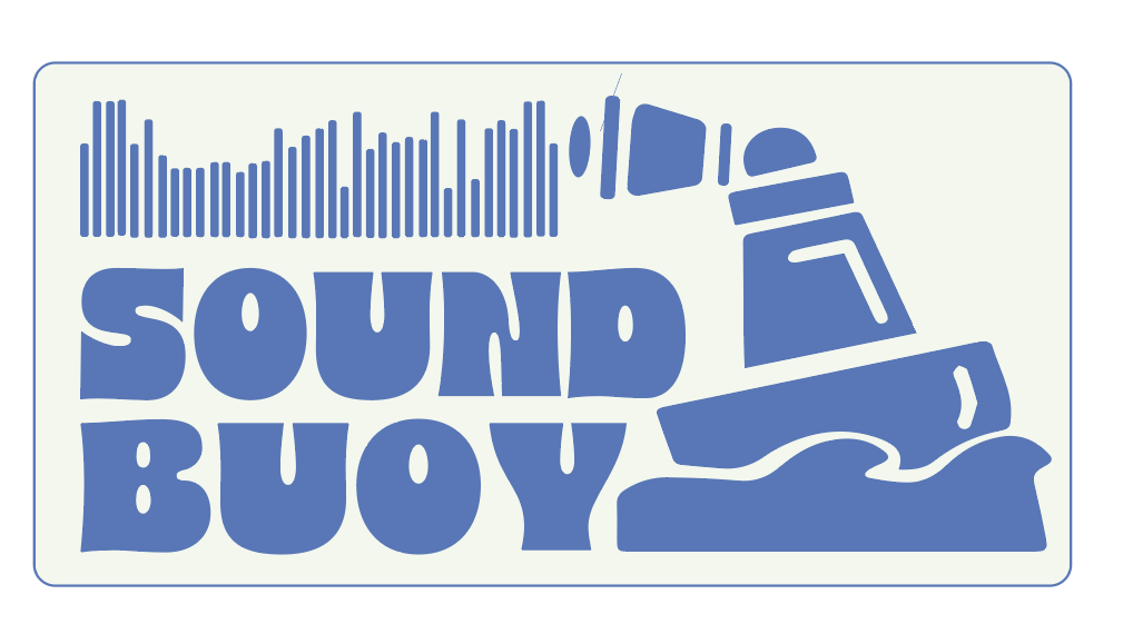
For this advert I will re-use some of my previous assets that I made on illustrator to maintain branding consistency.
Assets.


As I am designing for a mobile screen size I need to make sure I leave negative space so the screen doesn’t become cluttered, and consider Visual Hierarchy, The most important message (e.g., the call to action) should be the most prominent. Ensuring the user immediately knows what action they should take.
I also want to focus on information delivery, that I am getting the key point across in a short space of time. I believe that my use of colour theory and symbolism within my logo and branding does a good job of conveying the Brands core message.
Story Board and Final Advert.
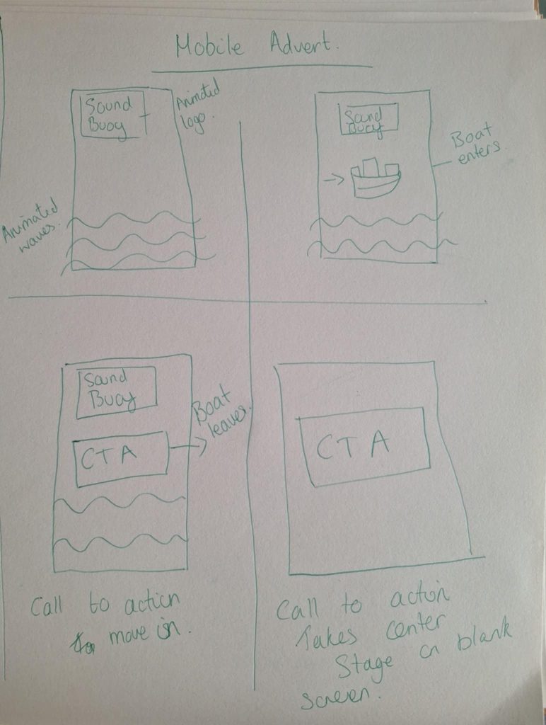
Story Board for mobile advert.
300×600 Mobile Advert.
Audio – Adobe Stock.
This mobile advert was designed with clarity, visual hierarchy, and brand identity in mind. By using negative space, strategic animation, and thoughtful colour choices, I feel I have made sure design is both engaging and effective in delivering the core message quickly and clearly on a small screen.
Bibliography.
https://stock.adobe.com/uk/