A banner for a consultancy page serves as the first point of visual contact with potential clients, so I think it should be clear, engaging, and professional whilst embracing the companies branding. I want to include,
- Company Logo
- Headline (Mission Statement)
- Subheading (what we do)
- Call to action (book appointment)
- Contact information.
Initially I accidentally added the measurements for the sky scraper banner the incorrect way round – and kicked myself when I realised, however I thought I would add the images in as part of my development. I feel it still serves as a good example of utilising empty space. I was please with how I avoided making it feel cluttered or over bearing.
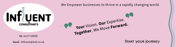
Incorrectly sized Static + Animated Banners.
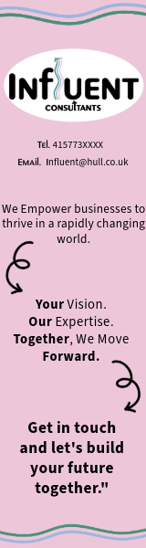
Correctly Sized Wide Sky Scraper Banner (static and animated)
160×600 pixels
Working on this banner, I tried very carefully to consider visual Hierarchy and how this would feel on a webpage. As the viewer will already be going from top – I wanted to give the banner the same flow. To do this. I started with a smaller Type size, start with 8 on the contact details, and jumping up two sizes each timed I moved the the piece of writing underneath. So by the time I got to the bottom CTA i was at number 12. Along side the size incline, I also slowly started adding in bold text on the words that are important to the companies ethos, this helps to add impact as you are reading. So at the bottom of the banner, the CTA is in bold and a the largest size – hopefully influencing the viewer to take action and contact the agency. To further reinforce the desired visual hierarchy, I used arrows in keeping with the the logo – to lead the reader to the next important part of the banner. By adding animation to the top/bottom of the page on the horizontal lines, I created distinction between the banner and the rest of the page Making it its own entity which is helpful in keeping the viewer engaged. I also added animation to the arrows, as they are important in the flow of the banner.
Overall I am pleased with this banner, I think I left the correct amount of empty space so the viewer didn’t feel overwhelmed and included only necessary and relevant assets. A reflection, of what a consultancy agency would aim to do when helping a business.
Mobile Banner (static and animated)
300 x 50 pixels.
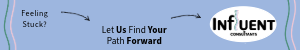
For my mobile banner I made sure to adapt the visual hierarchy to keep a smooth, engaging flow from left – right. I made sure to consider the smaller screen and how using as much content as the last banner may feel messy/untidy, since space is more limited on mobile. I made sure to keep the layout simple and clean removing some of the text, and replacing with more simple phrases. I used carefully positioned arrows (in keeping with the logo) to direct the viewer’s attention toward the next key point. To further enhance this, I used subtle animations on only the arrows to gently maintain the flow of engagement.\
Again, to separate the banner from the rest of the content, I added animated lines (from the logo) to either side of the banner, These create a clear visual distinction between the banner and the rest of the page, preventing the viewer from feeling overwhelmed and keeping them focused on the banners CTA.
I believe the way I have designed the banner re-enforces the modern and warm feeling I wanted to reflect in the logo of influent, it feels accessible and friendly, it also appeals to a broader spectrum of audience and avoids alienating with overly complex language or imagery.
Rectangle Banners (static and animated)
300 x 250 pixels
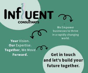
The banner has a clear storytelling structure, gradually guiding the viewer’s eyes from one section to the next, making sure each part builds on the one before it. As I used a zig zag structure, I cut back on adding some of the elements I have on the other banners – such as the moving arrow boarder, and focused more on drawing the reader eye to the text. I wanted to use a the green from the logo, as I have used green and pink previously – but it posed a slight challenge with legibility, this led me to add the circles behind the bold writing to add contrast and make the type easier to read. Then the writing in between, I changed to white as again this created more contrast and made the text easier to read (This also makes the banner more accessible, to people who may have any reading disabilities) whilst still maintaining a consistency within the branding.
The goal is that by the end of the banner the viewer feels that they have a basic understanding of the company. I also decided to leave specific contact details off the banner, this what a choise as I felt for this layout it would have interfered with the flow of the design. Instead I would make the last circle on the screen a button – I also think this design choice is a reflection on the way modern design is going. Rarely do people jot down numbers or email addresses – instead just using a link that easily takes them where then need to go.
I feel this design reflects the consultancy’s ethos of listening, problem-solving, and providing a structured, clear path forward without overwhelming the viewer.
All three of these banners work together harmoniously to create a feeling of what the Brand stands for, and most importantly what they are selling.