One.
For the first part of this assignment, I have been tasked to do early planning for three hypothetical briefs. I will start with some research and mood boards of what may be suitable for each brief and work from there.
Cab-E Online.
I have decided to focus my attention to a gap in the market for E-Cab Online. As a woman, safety when getting taxi’s (or any travel A-B) is a huge consideration of daily life. I have been in many situations, and so have the women I know where they have felt vulnerable or scared during a taxi journey. Unfortunately this also extends to other minorities in society. Therefor I wanted to create a Marketing Plan for Cab-E that provides all the things that your standard taxi service does not. Safety features that allow for sharing of location throughout the journey, or the option for Silent Journeys, or even the option to ask for a Female Driver.
However, taking this approach it would also be important to consider that I still need to make a business model that can appeal to the majority of society, without Alienating anybody. So my branding would need to be inclusive and show what the company stand for through use of colour – but still appeal to the traditional elements of Taxi Company Branding.
Eco Future.
As stated in my mood board, I wanted to land on a colour palette and concept that is inclusive of current design trends within Green Energy, without falling into the trap of it looking like everything else. The current trends for Green energy attempt to create a modern futuristic feel – in my opinion geared mainly toward the tech industry or towards people who already have knowledge of the industry. “The Tesla driver” I would say. This however immediately alienates people who have no knowledge of Renewable Energy, or who may already perceive it to be inaccessible to them. I want to create a feeling of accessibility and friendliness, by making my marketing educational and easy to understand and also create an element of fun. I will expand further on these Ideas if I decide to continue with this project.
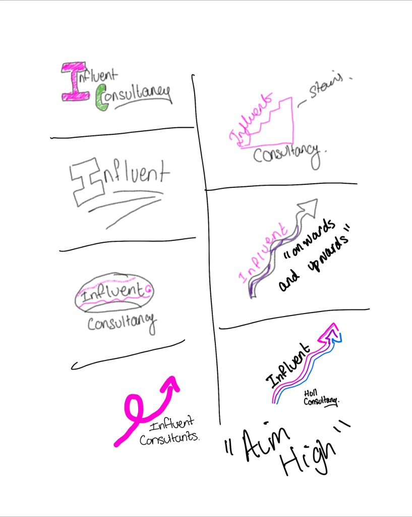
InfluentHull.
As I have briefly covered in the above mood board, I want to create a feeling for Influent that is modern, and full of energy, young and inspiring. Focusing also on Keeping the messaging clear and concise. A potential client should immediately understand what sets Influent apart. I would aim to avoid clutter and unnecessary complexity. This mirrors the problem-solving and efficient solutions Influent could offer.
I also want to focus on making it clear what the company does – some of the consultancy agencies I have researched have very unrelated imagery and or it is ambiguous, this i want to avoid as it could be the difference between winning or loosing a client.
Two. – Narrowed down, Influent Hull.
Continuing with this assignment, I have decided to expand of the Influent Hull Branding. I think it offers me an opportunity to explore an area that I have not previously researched or designed for, and may help me expand my horizons. I also feel that my initial Research and Style development has good potential.
Further Research – Competition in and outside of Hull
Embedded above is Loom consultancy in Hull, they have extremely different marketing to what I am proposing. The style of the home page means you can tell it is a Consultancy company – but then as it starts showing the video about a Loom machines, I became a little confused and lost about whether I was in fact on a consultancy page, or on a page for Looms machines.
With the current fast paced way that we live our lives, and social media platforms such as instagram and Tik Tok leading the way, I feel this long winded explanation will cause loss of custom as peoples attention spans have become shorter.
I want to make my Home Page Straight to the point, and simple. I also feel that the initial opening to the page – with the sky in the background is ambiguous as it does not relate to consultancy directly, or a Loom machine. Again, I want to make sure any imagery or content I include, directly relates to the companies strategy. The above website, would make me as a customer – presume that the advice I was given would be in alignment with the complexity of the website, and I think this is alienating.
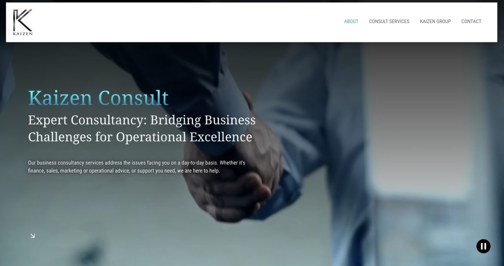
This is another consultancy group in hull, that is very focused on the professional, plain, un intimidating branding. Although they achieve this, they also achieve alienating potential groups of society. The home page has two, white males shaking hands – to me this very much reenforces the old school type of business mentality that I picked up on in previous branding, and doesn’t seem warm and inviting to anyone that might not fit into this specific criteria. I want to avoid this, and promote diversity and make a page that feel inclusive, warm and welcoming.
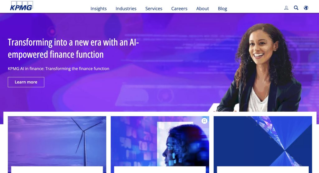
KPMG are in the top 4 Consultancy Firms in the UK, I wanted to include this as en example outside of Hull, because ultimately every company wants the possibility of expansion outside of their home town.
Their website on a very similar note follows the un-intimidating front page, that is simple. However the image on this page is a Woman of colour which could be argues that already offer a more forward thinking way of doing business, and they want to communicate this to any potential customers. Much like the two other pages tho, there isn’t alot to make this home page feel exciting or appealing to young people – They obviously have an incredibly successful business model, however as my company is new – I feel it is going to need to be able to stand out.
Logo Planning
Key Elements for consultancy logo.
-Simplicity and Clarity, Avoid overly complicated elements. A simple, clean logo ensures scalability (works on both large billboards and small business cards).
– Clear visual hierarchy, The most important elements (like the company name should stand out. The design should be easy to recognise at a glance.
-Clear Typography, San Serif font may be more Legible.
-Works with/without colour.
– Timelessness, While it is important for the logo to look modern, I need to ensure it doesn’t rely on short-lived trends that might become outdated quickly. This is the danger with using too much colour, or a stylised type face.
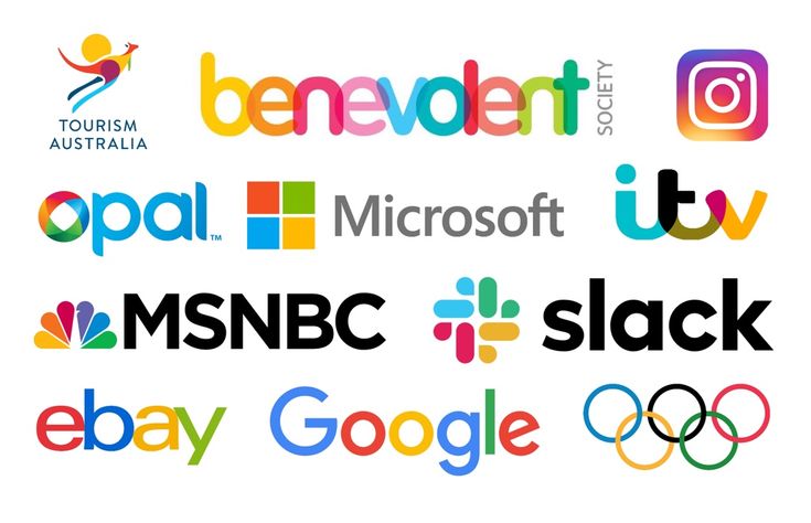
Above are some examples of colourful corporate logos that I found. Analysing well-established, successful examples provide valuable insights into design principles that resonate with audiences and contribute to a brand’s identity. Images above all cater to audiences familiar with simple imagery, uncomplicated layout and use of white space. within the logo.
Above is a more modern take on a colourful logo, I really enjoy the use of block colour – however when I consider this for print or merchandise, it gives a new set of challenges and would require more resources to achieve this logo off the screen.
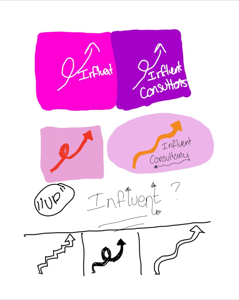
Considering the simplicity of the previous logos, but also making sure I bring a moderd twist – I wanted to try and incorporate imagery into my logo that would relate to consultancy, or business growth. Although an arrow may seem “obvious” it is a symbol that people can relate to. It can be used to clearly show an upwards trajectory and this is the overall goal of a consultancy firm – to aid growth.
I also think because I have decided to use an unusual colour palette, that doesn’t have many existing connotations to consultancy industry – using a symbol that is a little more “obvious” will aid advertising to a wider market.

Above I collected some reference arrows, for inspiration off Adobe Express. I will experiment further with different colour combinations, shapes, and thickness, Paired in different typography to see what works well.
Type Face/ Tag Line.
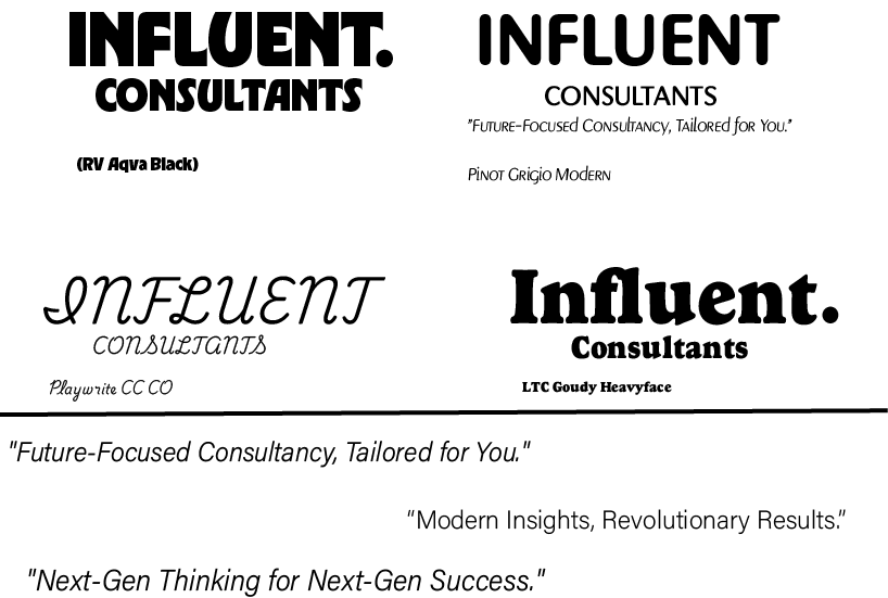
Before beginning, I decided to use a slightly rounded Type Face, Or Font family. Soft curves can help create a sense of warmth and balance, which can help foster a positive connection with the viewer. I believe it feels more approachable.
The Flow of round letterforms tend to feel more inviting and less rigid than other more angular text, in turn making the logo feel more accessible. I aim to prioritise legibility and warmth, I believe all these typefaces strike an effective balance between form and function. They also bring a funky feeling to the design, without falling into any current trends that may deem them unsuitable in the near future.
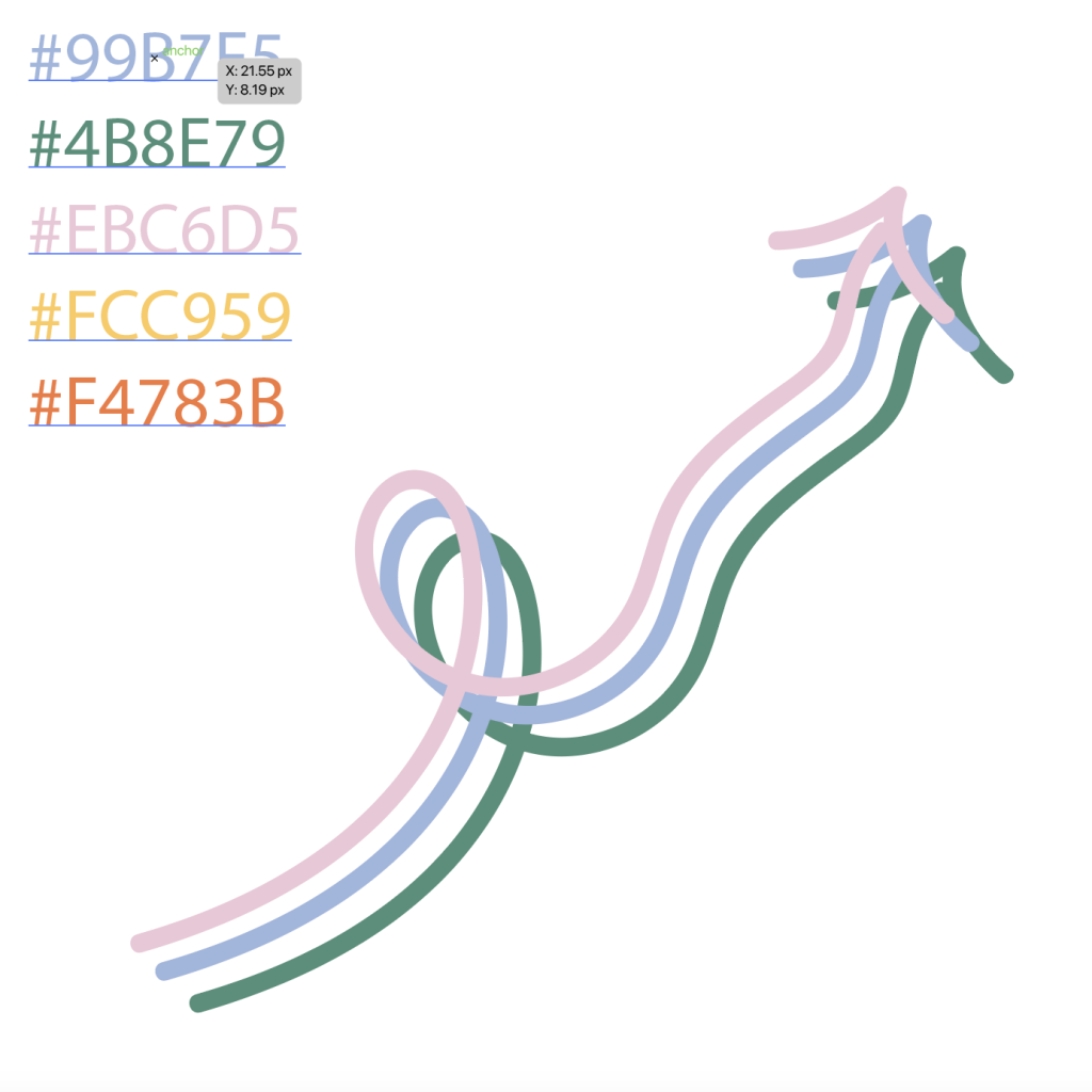
My Palette
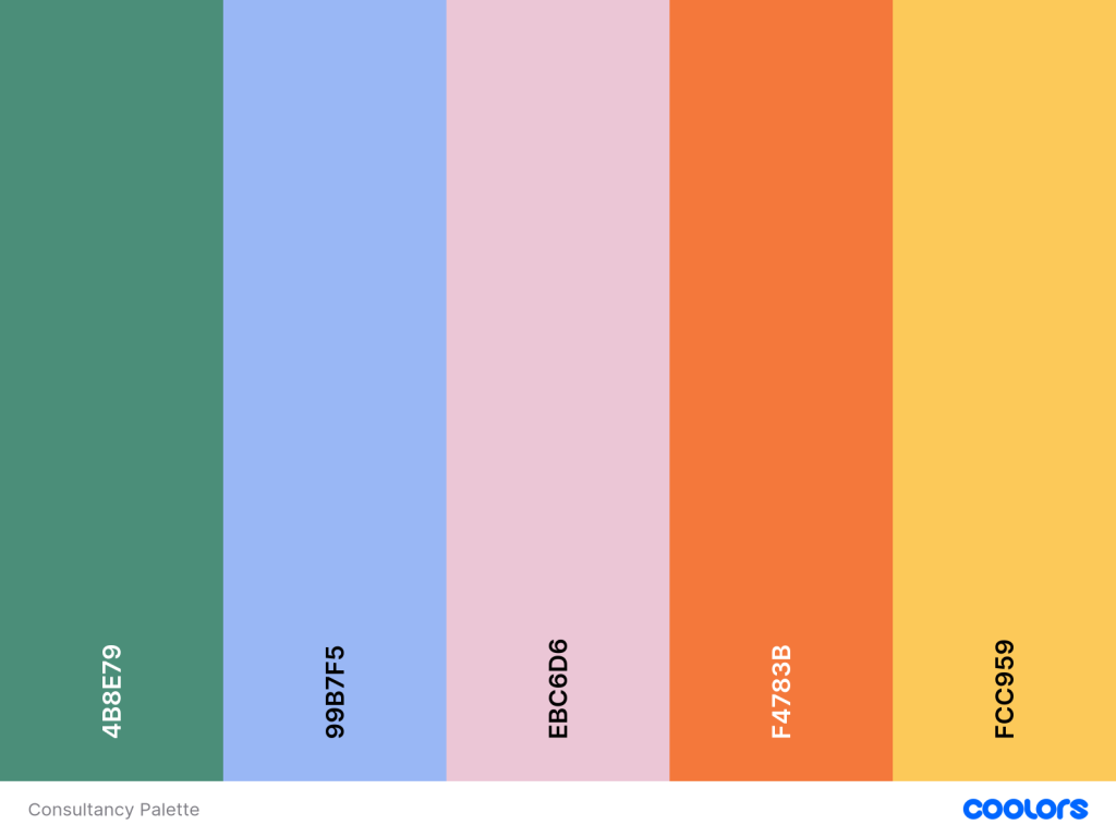
Primary Colours
Green – Reflects growth, innovation, and balance.
Blue – Symbolises trust, stability, and
Pink – Warm, affectionate, welcoming. professionalism.
Secondary Colours
Orange and yellow – Convey creativity, enthusiasm, and energy.
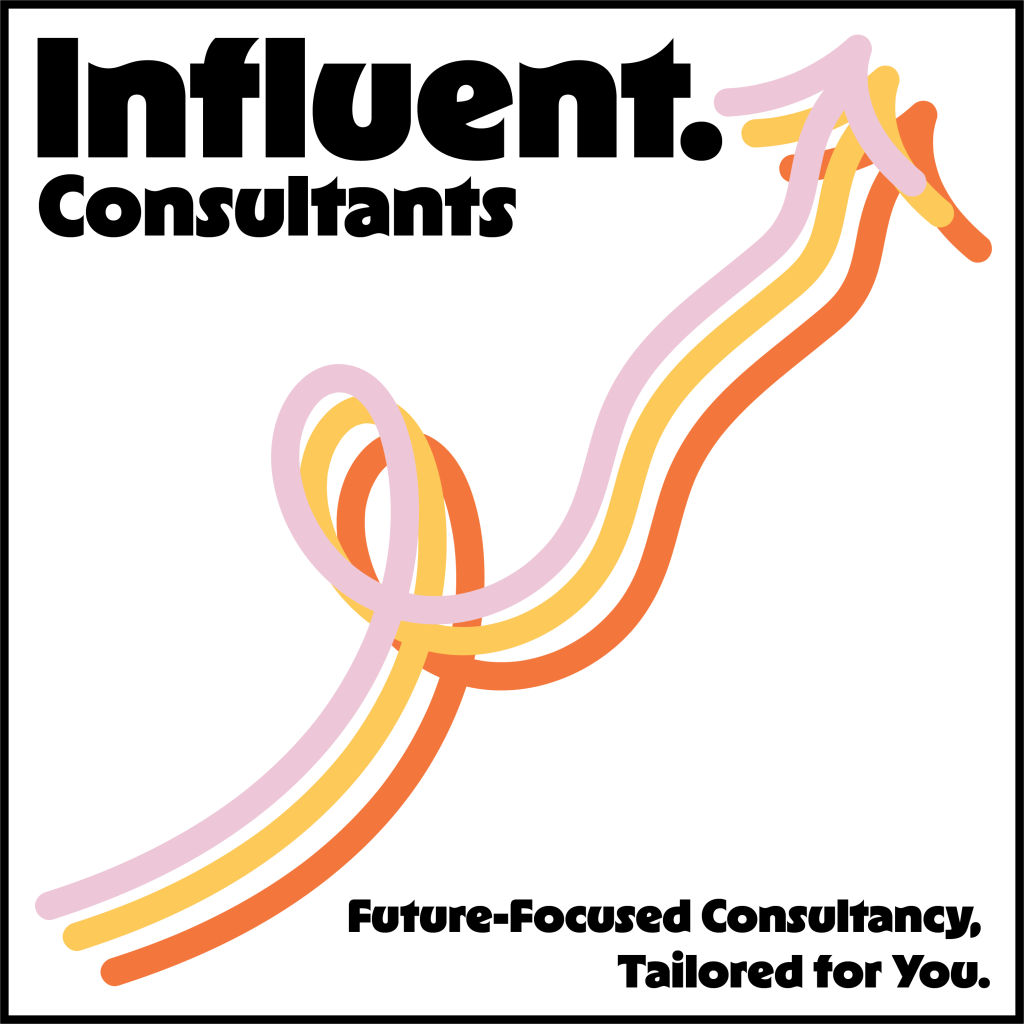
Logo drafts.
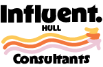
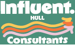
The Below Screen Logos, at 150 pixels squared, and 72DPI to Show how the Logo would look at a smaller size.
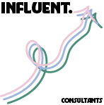
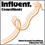
After playing with these Logo Sizes I have realised that they have too much detail for such a small size of image, and if I want to shrink a logo down to this size and it still look effective I may have to make the smaller versions less detailed.
However over all I am pleased with this logo and I think it allows for further experimentation using my selected colour palette. The colours can be swapped and interchanged with each other to suite the background colour, useful for items such as merchandise or print where the background colour may be swapped and changed.
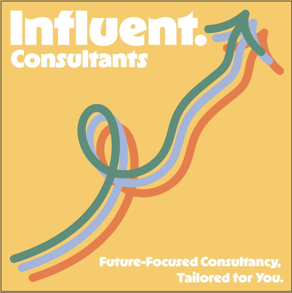
I have included these variations, to show how versatile the colour palette is, and how legible the writing is, however I feel the logo has lost its element of simplicity. It feels messy and over bearing, there is too much colour and makes it hard to focus on the name of the company. Unfortunatley, I think as I explored further I lost the element of professionalism that I was hoping for – the logo as become more suited for a less serious subject. While I can appreciate that it would stand out this logo feels too busy. suggest going back to the drawing board with a more focused color scheme and a clearer, more refined design.
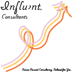
Further experimentation
Length 150 pixels, and 72DPI
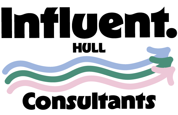
I feel enthusiastic about this second logo, as I feel it incorporates somewhat of a maritime theme with the way the arrows are laid out – almost like waves. I also feel that this logo does a better job of being scalable, it has the same legibility on both the print and screen logos. However using the same colour palette allows me to maintain the versatility of the logo for use on different platforms.
further Logo trials.
Left : Screen
Right: Print.
I really like the style of this logo, I have stripped it back to feel more professional and less distracting from the business name, however there as some elements like the L in consultants that I find unbalanced and distrating, I am also unsure of if the orange works well as the outline.
Final Logos presentation book.
Each logo has – Screen Version at 150 pixels Width, and 72 DPI
– Physical Use Logo at 750 pixels width, and 300 DPI
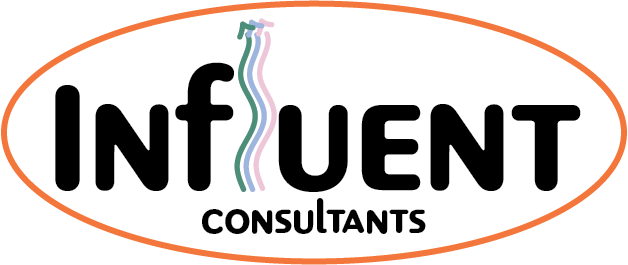
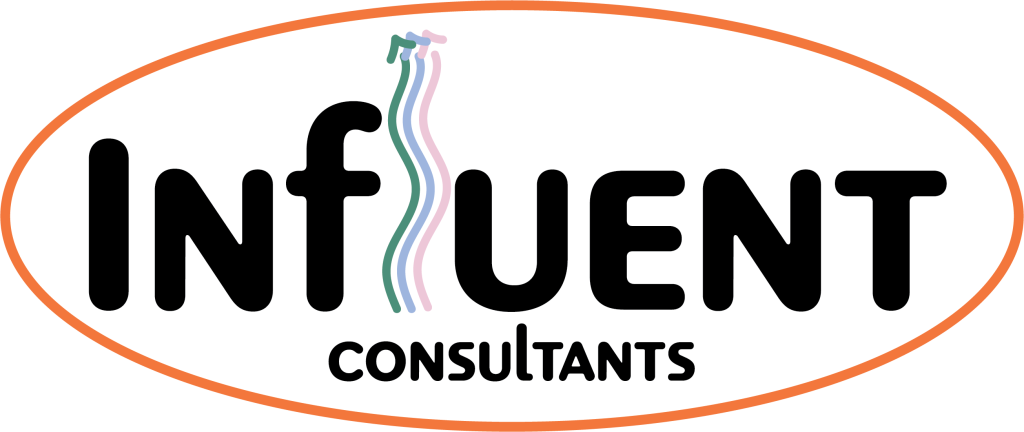
Logo 1) The typeface used for the company name is clear and easily readable, with the letters spaced adequately for better visibility. The Gentle wave of the arrows are in alignment with Hulls maritime history and a nod to local culture,there is no ambiguity surrounding what this logo is for, making it easy to look at. This is an ideal logo if you are looking for something to the point – with a reference to Hull specifically.
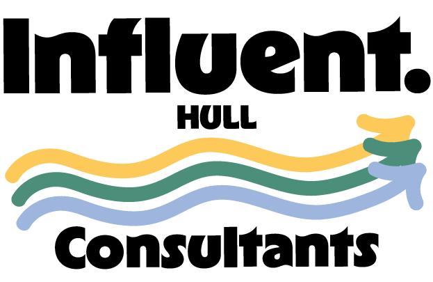
Logo 2) The letterforms are well-spaced and have strong contrast against the background, ensuring readability in both print and digital formats, whilst embracing the Unique way the Letter L has been altered in both words. The arrows pointing upwards imply Influent will have this effect on the clients interests. This logo allows flexibility in both screen and print design, and demonstated on the business card how it has been set into and oval shape. This logo would be a great choice for less bulky use of colour, but still having a warm pop of friendliness.
Logo 3) The Wild Card, This logo does not follow traditional rules of visual Hierarchy, and is not contained within an obvious space. This makes the logo intriguing, and out of the ordinary. It still succeeds clear legibility and the anti – classic way it is laid out feel exciting. This would be a great logo if you where looking to make s statement and step outside the normal confinement of a consultancy logo.
References.
Adobe. “Adobe Fonts.” Adobe Fonts, 2016, fonts.adobe.com/.
kaizen. “Kaizen Consult, Hull Consultancy: Bridging Business Challenges for Operational and Financial Excellence.” Kaizengroup.uk, 2024, www.kaizengroup.uk/kaizen-consult/kaizen-consult. Accessed 14 Jan. 2025.
kem. “Colorful Logo Design.” Pinterest, 3 Oct. 2023, au.pinterest.com/pin/688910074275489449/. Accessed 21 Jan. 2025.
KPMG. “KPMG in the UK – KPMG United Kingdom.” KPMG, 13 Feb. 2023, kpmg.com/uk/en/home.html. Accessed 2025.
Loom . “Loom Consultancy Ltd. | Build a Sustainable, Scaleable and Sellable Venture.” Loom-Consultancy.co.uk, 2025, loom-consultancy.co.uk/. Accessed 14 Jan. 2025.
O’Connor, Zena. “Colorful Logo Ideas.” Pinterest, 7 Mar. 2019, au.pinterest.com/pin/291185932157157190/. Accessed 21 Jan. 2025.