Breakdown of Pages/content.
Homepage
- Mission Statement: A brief, clear statement of what WWF stand for.
- Impact Highlight: Showcase the difference your non-profit makes, testimonials
- Call-to-Action (CTA): Prominent buttons for key actions (e.g., “Donate,” “Volunteer,” “Learn More”).
- Visuals: High-quality images or videos that reflect WWF and its mission.
About Page
- Who You Are: Information about WWF history, vision, and values.
- Accomplishments: Major milestones or achievements to build credibility.
- Impact Stories: Examples or case studies showing WWF action.
Get involved
- Volunteer: Information about how people can help in person or remotely.
- Partnership: Information for businesses or organisations that want to collaborate.
- Other Ways to Help: Include options like fundraising, or donations of goods.
Donate Page
- Secure Donation Form: User-friendly donation form.
- Donation Tiers: Suggested giving levels with examples of impact.
- Recurring Donation Option: Encourage ongoing support.
I chose the 4 above pages to focus on for my wire framing because they contain the essentials that promote the WWF and encourage CFA to visitors to the website.
By ensuring these pages are well-structured and visually appealing during the wire framing and prototyping stages, I can aim to create a strong foundation for user experience also.
Low Res Wire Frames
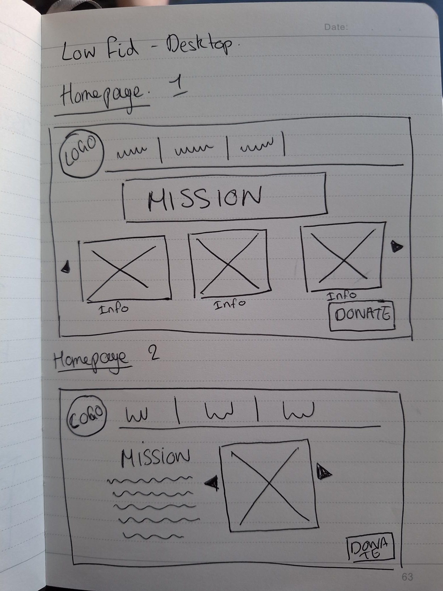

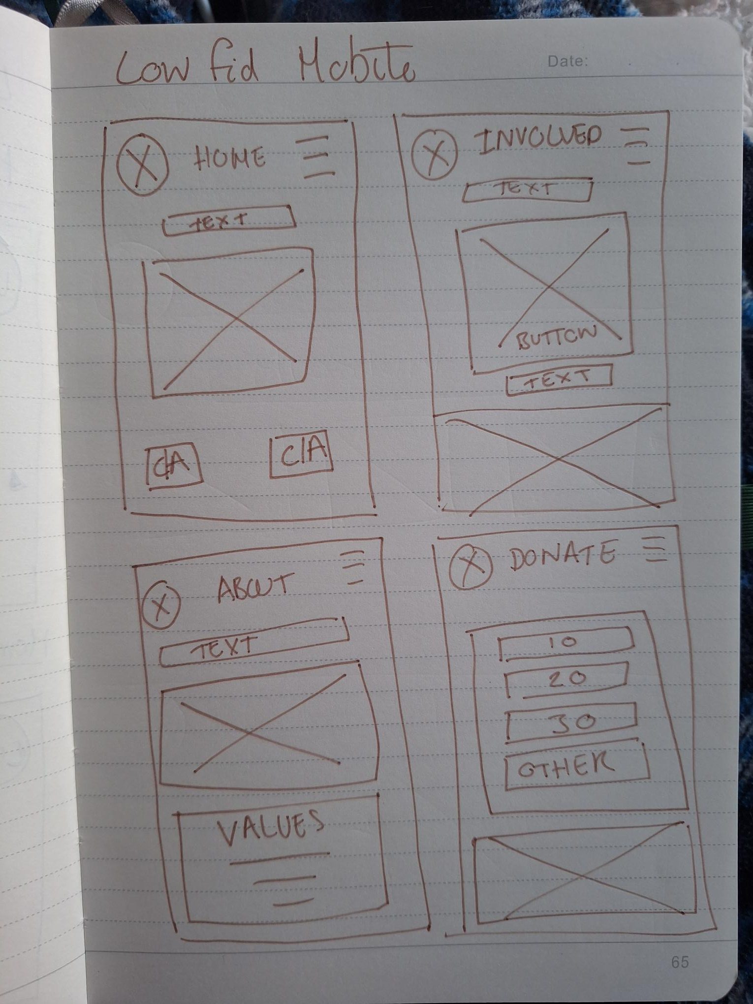
Here I just did some very basic hand drawn ideas, of what my designs might look like on a page, considering the above features that I wanted to include. It did help me to start the process, but I think it also confused me slightly because it is so stripped back its hard to imagine how any information or text would actually look. So I was eager to get onto the next stage.
Med Res Wire Frames
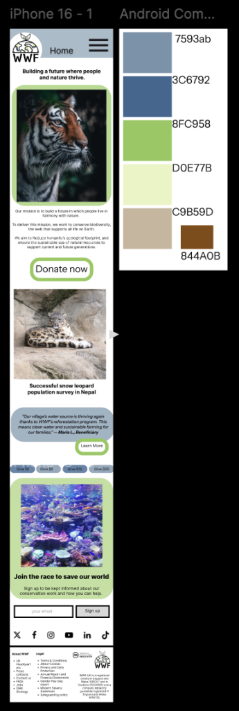
Although my website would be given responsive design features, I decided to use a standard Desktop size Screen 1140 x 1024 (left below) and a i phone 16 screen size 393 x 852 (below right) to show how I could fit the same content into both.
Home Page

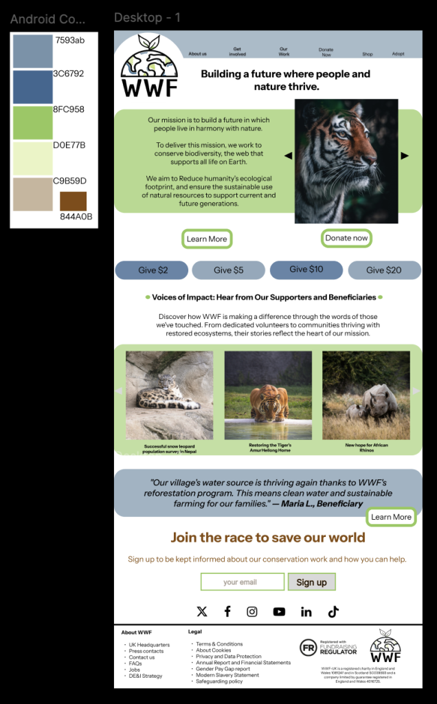
I am over all pleased with the mid fid, homepage wire frames and I have tried to stay within the constraints of key graphic design principles, such as visual hierarchy. By using a large headline “Building a future where people and nature thrive” establishes a clear focal point and communicates the intentions of the WWF immediately. I also considered how CTA Buttons like “Learn More” and “Donate Now” are visually distinct, guiding users’ attention towards them, as they are important.
I also made sure content is well-aligned, with consistent margins and spacing, aiming to make the layout appear organised and clean, in turn making UX better.
As I develop further, I may consider making my logo smaller – as I have struggled to create balance through the heading as the logo is off centre. Technically I have also found it challenging overall learning to use Figma, its a program that I have never used before learning how the pages/layers work and where different buttons are positioned was not intuitive.
Whilst I was making the footer panel for my website, I decided to use the information off the current WWF web page so that it is accurate, as Legal information and about me info need to be correct. (WWF,2024)
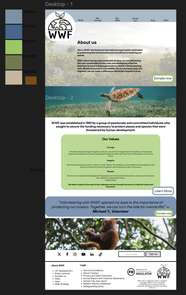
About Us
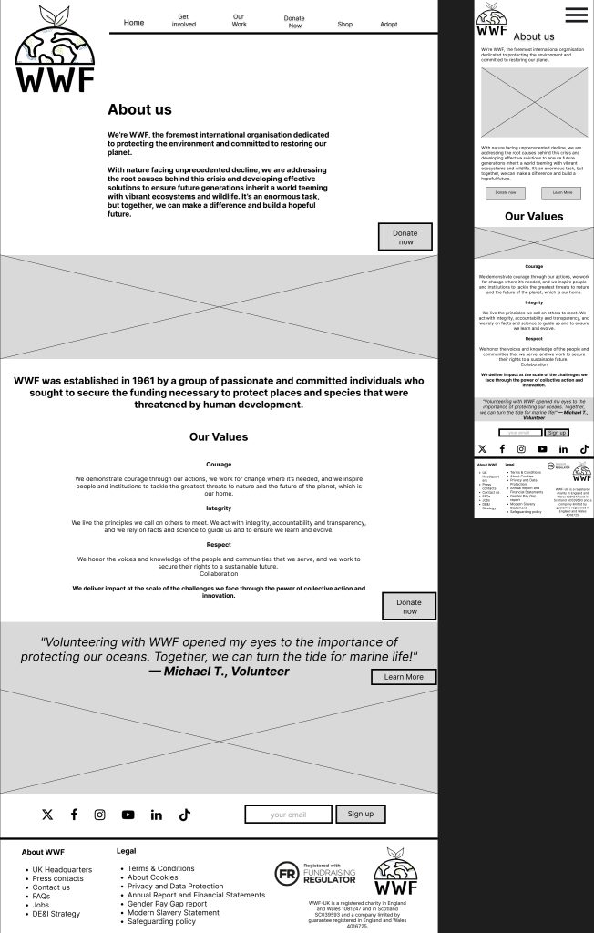
I concentrated on the structure of the About Us page, I wanted to make it clear, legible and concise. I logically divided into sections (About Us, History, Values, and Testimonial). This makes the content scannable and easy to navigate. As a visitor to the page – I want the reader to presented with the important information – not have to look for it. Again, I focused on CTA buttons and placing them strategically along side information that may encourage people to donate.
The testimonials I have included, are not authentic quotes – I have written them just as almost place fillers but if the website was to become up and running, I would be able to replace them with real testimonials.
I am also open to slightly changing the layout as I ad colours and images to my webpage.
Get Involved
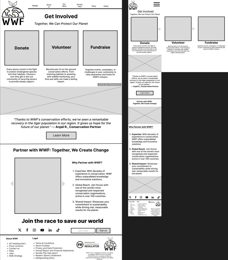
For the Get Involved page, I wanted to communicate very clearly using visual hierarchy and CTA buttons to immediately guide the user to their options. I think this translated well to the mobile design, using the carrousel also to fit the buttons so that the screen doesn’t feel too congested – as that can easily happen with a mobile site.
Donate Page
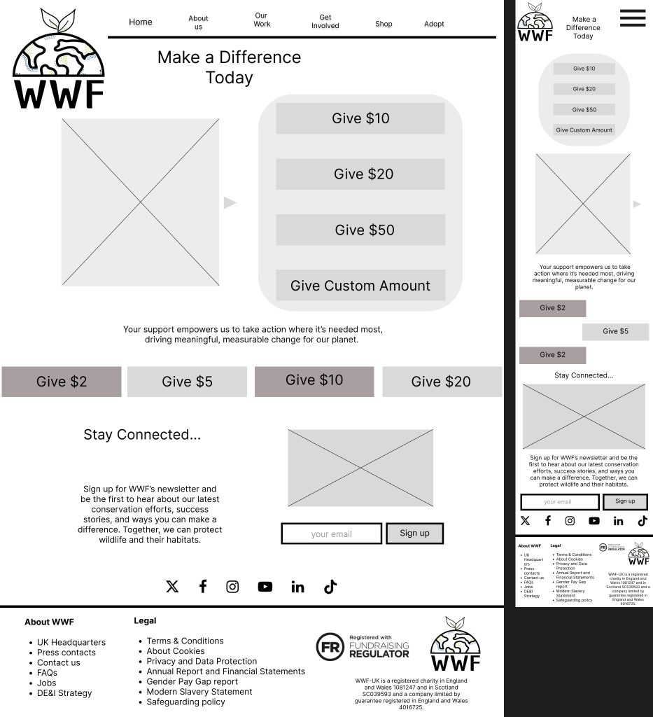
Important features I want to include on this page, where options to single click choose a donation amount. I think I could add specific references of what donation amounts could do eg “$10 could get you etc” but I could do this further down when I have been given more infomation from the WWF to include in the website.
High Fid
(Singh,25) (Liu,24)(Crisp,24)(Latrach,24)
(Unsplash,24) (Mizushima,24) (Teodor Kuduschiev,24)
Thoughts & Feedback
I am satisfied with my mock ups, and that I have taken into account graphic design principles and also the brief that I was given. I asked some of my friends/family for feedback and this is what they said. I feel the website does a great job in terms of balance. There’s a pleasing symmetry in the layout, where visual elements such as text, images, and buttons are evenly distributed across the screen without being too strictly organised. They visual hierarchy guides the eye from place – place gently.
While the homepage has a clean, minimalist structure, I think it avoids feeling too sparse by placing elements like call-to-action buttons and portfolio previews in a way that off sets the order. I also really concentrated on the balance between negative space and content making sure there wasn’t too much of either.
Throughout all the website I have tried to use repetition of design elements to contribute to the site’s over all cohesiveness. Iconography of the buttons also contributes to the feeling of consistency from page – page.
I also think the care and attention I put in to accessibility has paid off, the colour palette makes sense for a nature charity – but it also means content is clear and legible. Text stands out clearly against the background, and the use of softened colours behind black text draws attention to important information.
I asked some friends and family for their thought on the website –
“The colour palette is good in keeping with the themes of the website, and sub consciously encourages the viewer into interacting further. The information is well presented, in a concise manner, that also encourages the continuance of the user journey and hopefully donation. An excellent draft design that should allow further customisation in the future to meet WWFs needs” – John Hannah
This makes me really happy, as my dad has a background in design and also works for the council so he has an eye for what could be classed as inclusive/accessible. I think he is correct about further customisation, but that can come along with further content.
“I like that the main page has donate right there to encourage the person viewing to donate it’s very clear.” – Rachel Hannah
This feed back comes from my sister, who has no design experience or pre-conceived notions about what should/shouldn’t be included on a non-profit website. So the fact that she noticed the donate button is important, it means my idea of visual hierarchy is working as planned.
Challenges
I would say one of the biggest challenges i have faced is creating layouts that adapt across different screen sizes (desktop, mobile) as keeping consistency between the different sizes, but also moving the content to make sure it flowed properly. I achieved this by keeping the content similar but not EXACT and also, I have kept in mind that Figma does have a responsive element to it – and I could utilise this further in future tasks.
Next has been managing all of my files, and work. Although this sounds simple – I have been away from computer work for a long time. So making sure I have used the correct file sizes, and suitable quality images has been an extra challenge for me, I watched a few simple guides when starting off to help me get to grips with this.
Next would be designing a visually appealing website that remains accessible to users with disabilities can be complex, I feel that I have shown thorough working on how I have tried to achieve this within my design, but going ahead further – I could strive to include a way of adding spoken word to my website to that anyone with visual impairments would find the website easier to use.
Bibliography
Crisp, Donnie Ray. “Brown and Black Tiger in Close up Photography.” Unsplash.com, Unsplash, 11 Nov. 2020, unsplash.com/photos/brown-and-black-tiger-in-close-up-photography-66zrT0dJ7Mc. Accessed 2 Jan. 2025.
Latrach, Mohamed Jamil. “Photo of White and Black Tiger.” Unsplash.com, Unsplash, 14 Oct. 2019, unsplash.com/photos/photo-of-white-and-black-tiger-wS2TfbwkmRQ. Accessed 2 Jan. 2025.
Liu, Andrew. “Two Rhinoceros on Brown Grass Field during Daytime.” Unsplash.com, Unsplash, 7 Feb. 2021, unsplash.com/photos/two-rhinoceros-on-brown-grass-field-during-daytime-EunFGVJLPmQ. Accessed 2 Jan. 2025.
Mizushima, Eutah. “River between Trees under Blue Sky.” Unsplash.com, Unsplash, 13 Sept. 2015, unsplash.com/photos/river-between-trees-under-blue-sky-OWwK_0_EnxY. Accessed 2 Jan. 2025.
Singh, Ratanjot. “Brown and Black Tiger near Body of Water.” Unsplash.com, Unsplash, 11 May 2018, unsplash.com/photos/brown-and-black-tiger-near-body-of-water-UIhc7sohnvc. Accessed 2 Jan. 2025.
Teodor Kuduschiev. “Brown Baby Monkey on Twigs during Daytime.” Unsplash.com, Unsplash, 22 Nov. 2018, unsplash.com/photos/brown-baby-monkey-on-twigs-during-daytime-TwSlFj4rHEc. Accessed 2 Jan. 2024.
Unsplash. “Photo by David Troeger on Unsplash.” Unsplash.com, 16 Sept. 2019, unsplash.com/photos/brown-turtle-in-body-of-water-9XzyEzPAHMI.
WWF. “We Are WWF.” WWF, 2018, www.wwf.org.uk/. Accessed 2024.