In this project I will aim to consider all my previous research, to create a new brand identity and multi channel marketing strategy for the WWF. I will consider a few main points, and how I aim to Achieve them.
Boost Engagement and Brand visibility:
- Interactive content would keep people on the Web page and allow for more attachment to be made with WWF.
- Collaboration with Celebrities or Influencers through social media.
- Bill board/ bus stop advertising for mass exposure to WWF.
- Utilise targeted adds (Facebook instagram)
- Utilise outbound marketing techniques.
Measure & Improve impact.
- Analytics tools (google analytics)
- Conduct Surveys on consumer feedback to assess if WWF is resonating.
Boost Donations.
- Easy to navigate donation tools.
- Show direct impact – what can a donation of £10 specifically do?
- Highlight call to action quickly – don’t make people search for an excuse to donate.
Ensure inclusivity and accessibility.
- Simplicity! Overly complicated platforms that are hard to navigate can immediately alienate.
- Visual Hierarchy, guiding the user around my Web page so they don’t have to try and search for content.
Visually appealing and appropriate design.
- Ensure consistency within my design and marketing, that is applicable for WWF and its themes of saving animals/the planet.
- Consider sustainability and ethics within my design, practice what the WWF preaches.
I feel that the current WWF Website lacks simplicity, I get the feeling it has slowly had more and more added to it. I have struggled as someone without any disabilities to navigate the website and pick out the important parts of information amongst the large amounts of Text and overlapping images/buttons.
I am going to aim to create a new platform, that focus’ on communicating Who They are, How your donations can help and showing the direct impact of The WWF. I want my new branding to feel easy, and relatable to all ages ranges and be relatable to the brand and what it stands for.
A challenge I face, will be separating myself enough from previous branding, to create a completely new look and feel, whilst still acknowledging the already strong roots of the WWF as a non-profit.
Initial Design Ideas.
Initial Designs.
After my initial sketches (detailed in my previous posts) I narrowed down my colour palette using word association for colours. I wrote down things that initially spring to mind when thinking about the WWF and then the colours they match with.
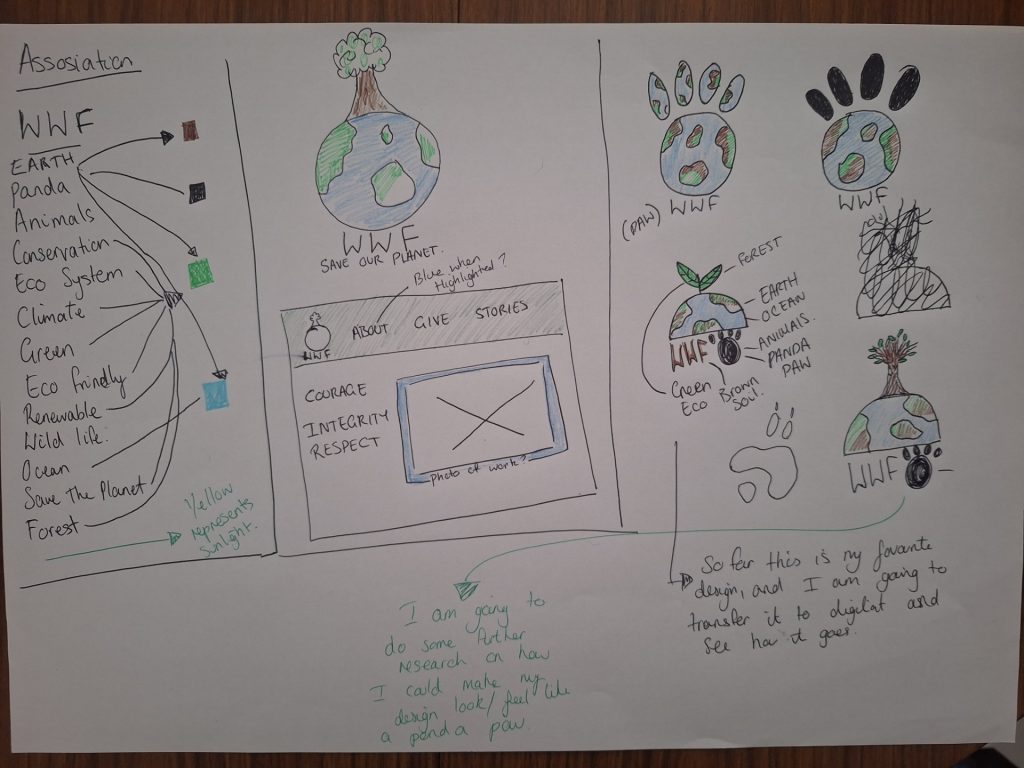
Next I researched other branding for animal and planet charities to see what the public may already be exposed to in terms of suitable colours, and if I am heading down the right path with my designs.
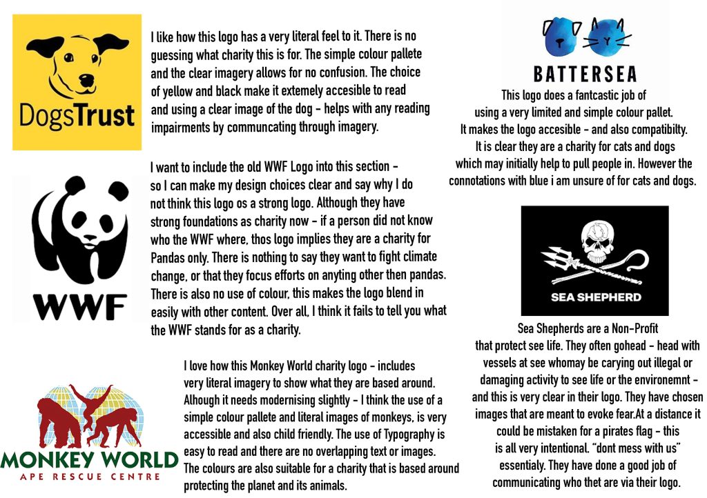
After looking more closely at other Charity logos, I feel that I am heading in the correct direction. Next I am going to do some further research on my colour palette, and transfer my sketches into a digital format so that I can experiment further with composition.
Earth.
WWF talks about how they want animals, plants and humans to live in harmony on the earth. So I want to represent this in each different element of my logo.
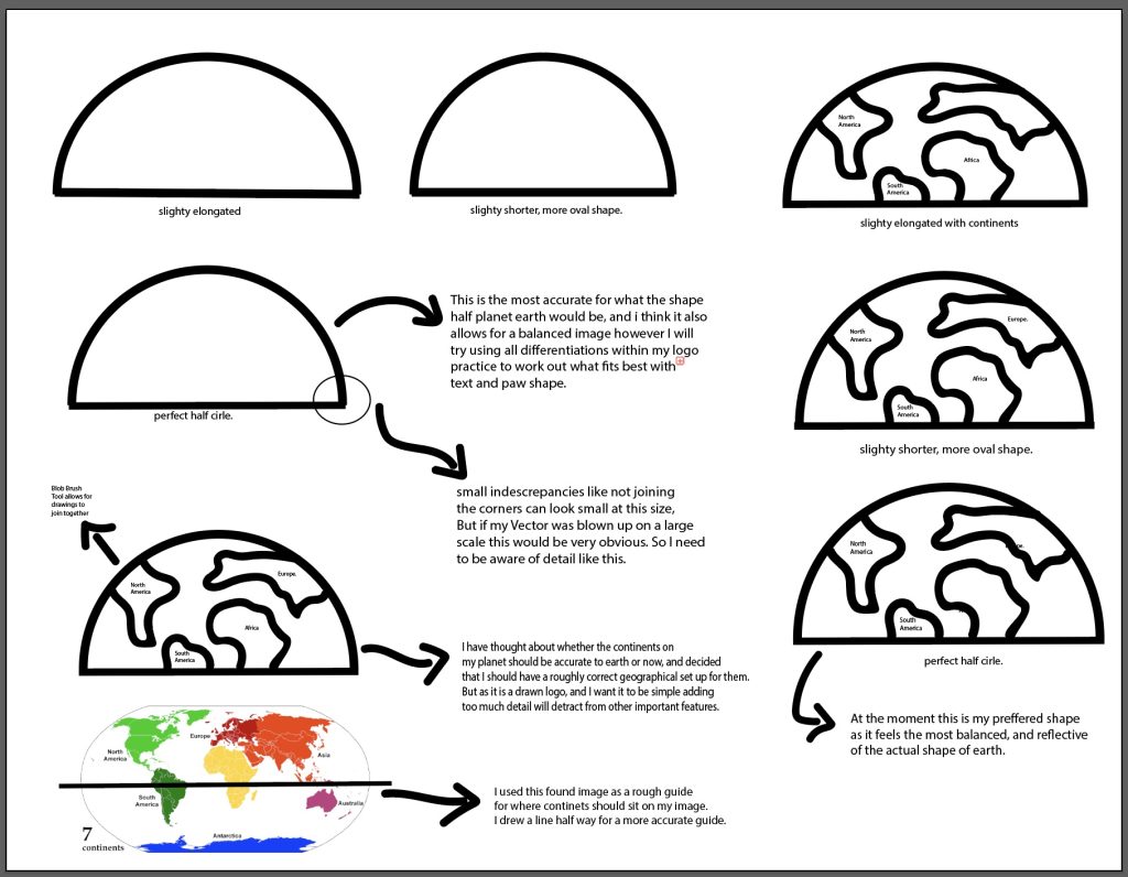
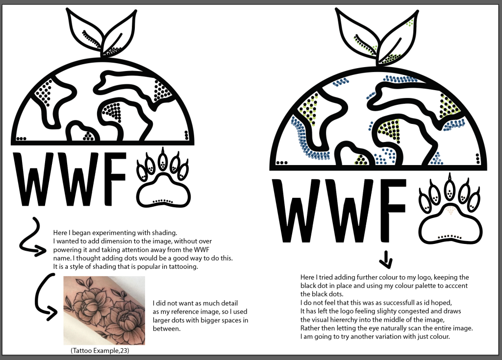
Above I have outlined how I began to experiment with shapes for my earth, and how I developed the shape of the continents. I am happy with the result, I think i’ve managed to consider how I can make the logo geographically accurate – along side it being accessible for mass market. My Next step is to add the “plant” part of my logo. Which would represent saving the rainforest.
Plant
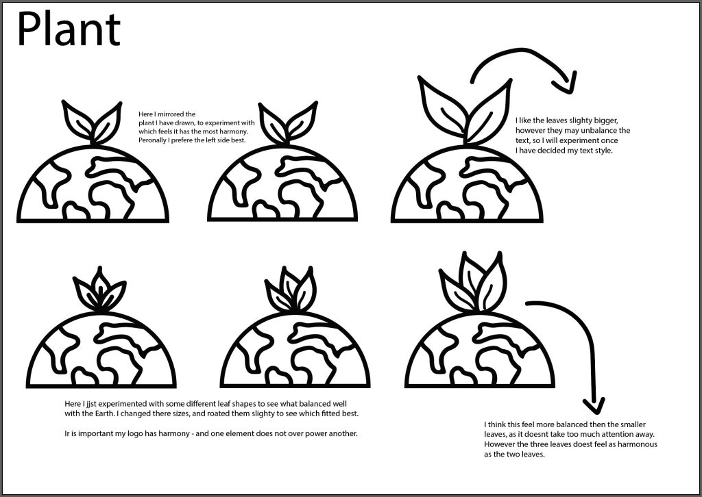
Here I started experimenting with the leaves on my logo, I want to try different shapes for them – and different combinations of size and mirroring them. I am still unsure of what is the most suitable outcome, as it is without the text and animal paw that I am looking at it. So next I will decide on font – and the shape of paw I want to use, then test more potential outcomes.
Paw
My initial idea was to include a very basic paw shape into my logo – “generic” if you like. However after doing some sketches, I had the idea to make it more of a nod to the current WWF branding – I could include a Panda paw. This would also be something that the public would connect with the current WWF branding.
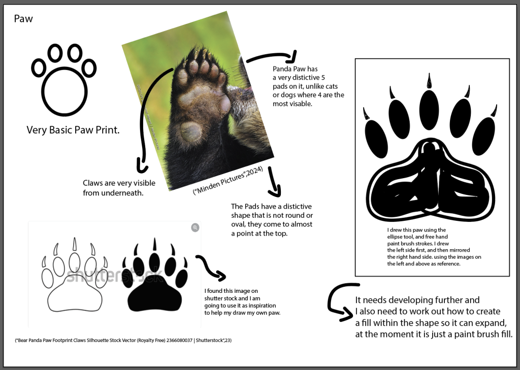
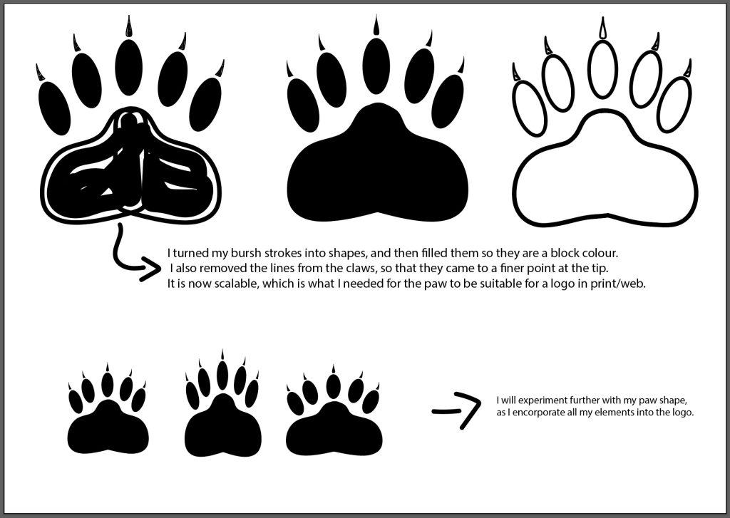
My initial idea to fill the paw shape dark, did not feel balanced when I transferred it to the other outlines elements of my logo, as you can see in the following examples. So I decided to develop a new paw shape and claws using the pen tool, so that it could have a clean outline.
There are still some tweaks that need to be done, but I am satisfied with my initial attempts – and think it is important to stay flexible during this process.
Font
Here I used Adobe Fonts to look for something that I felt would suite the WWF. The main Features I wanted the text to achieve where:
- Approachable – Sans Serif, are rounded and softer looking fonts. They feel more relatable then Serif Fonts in my opinion.
- Legible and Readable – I want my font to be easy to read. This will make it as accessible as possible, and will aid clarity on print versions of the logo.
- Versatile Across Platforms – I should take into account that the logo will be used on many different screen sizes, and platforms so it needs to be easily scalable.
- Modern , but avoiding trends. I want to font to be potentially be timeless – not attached to a trend or an style Era. EG – 70s style font.
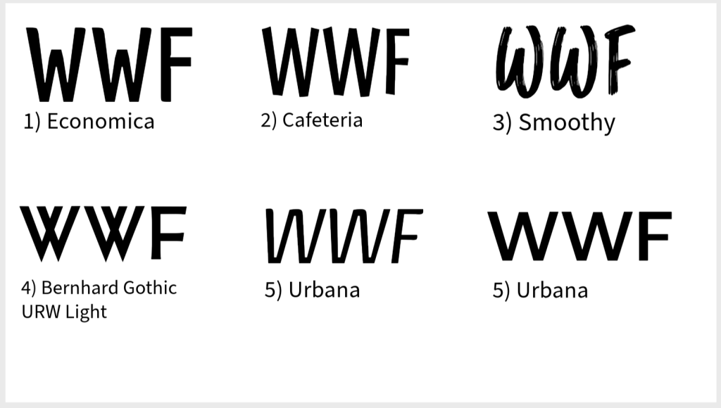
I chose all of the above fonts off Adobe, as I think they all met my initial requirements. They are all legible, but also have style to them. However I think 1), 2) and 3) are my favourites, none are too italic, which will sit nicely in my logo as it has a round shape – which could be thrown off by a slanted text. I will continue to experiment with all elements to see what works best.
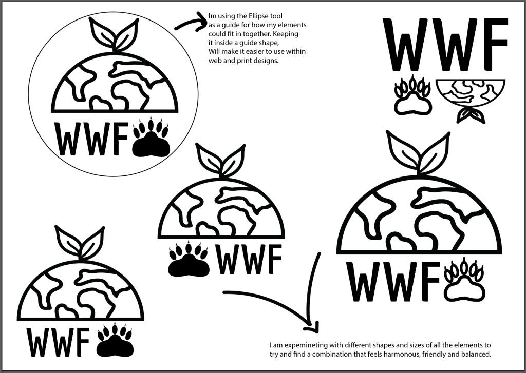
Combining Elements
Colour Palette.
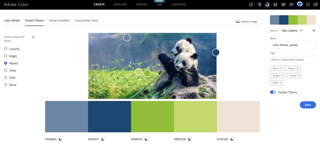
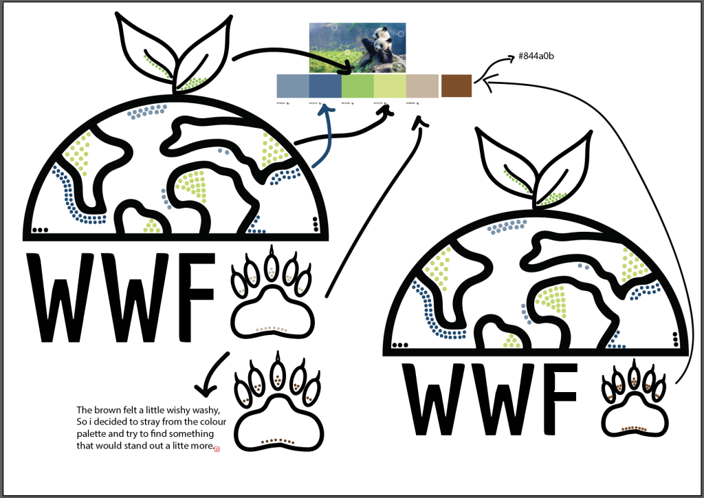
I decided to experiment with Adobe Color for my palette, it allows you to upload a photograph and then extract colours into Hex code. I thought this could be special – as it allows for me to draw directly from the nature that WWF are trying to protect. Using images of Pandas, is also cohesive with my branding idea for using a panda paw.
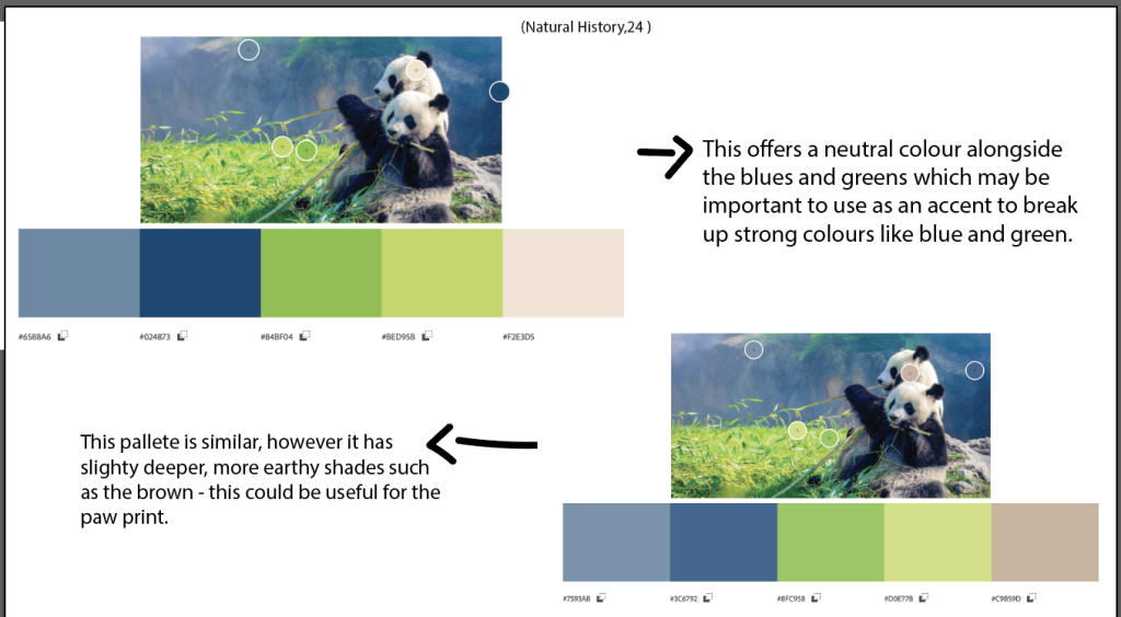
I transferred different palettes into illustrator to compare how they could work with my logo.
Accessibility Considerations.
When deciding on a colour palette, I need to ensure that it is suitable for a wide audience – I want to ensure the colours are accessible. Below I am including examples of how Adobe Color can aid with this.
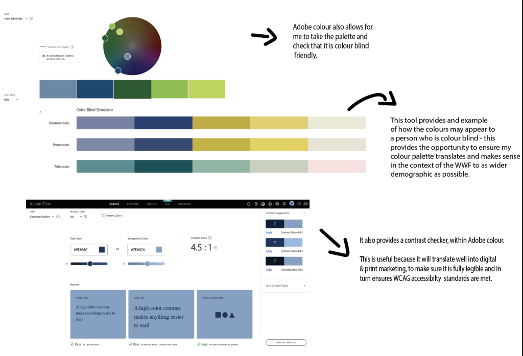
The consideration of the WCAG guidelines will improve usability of my website, and promote equality and inclusion, by demonstrating a commitment to making recourses available for all potential users.
Final Logo experiments.
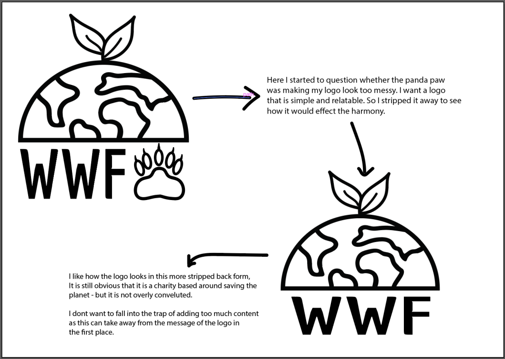
I feel really happy with the drafts above, but I am still not happy with the overall hierarchy of the logo. So I am wondering if removing the panda paw might give better balance and symmetry – it feel a little cluttered and busy.
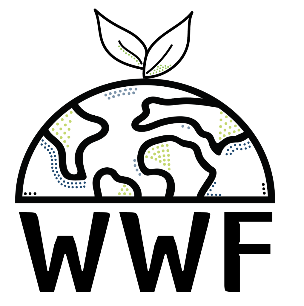
Final logo.
Here I removed the panda paw, and I am much happier with the over all balance of the logo. I think it communicates well what the goal of the charity is. I have considered important graphic design elements, such as hierarchy, alignment, balance, and white space in order to allow the logo to be easy for the viewer. It is also a design that allows for flexibility – It would be presented in different colours, or inverted for a night mode design of the web.
Challenges.
Over all I wanted my logo to be human – I wanted it to have a feel of softness and relatability, so although I know there are small areas that are not perfect, I wanted this. Imperfection (in my opinion) is a reflecting of being real and honest, something important for a none profit. But I faced many challenges throughout the design process. Such as;
Dot Patterns – Adding uniform dot patterns to specific areas could have required precise placement using the pattern or scatter brush tools, but I preferred to use the ellipse and hand place the dots, giving it a more natural feel as though it had been drawn by hand.
Creating Symmetry and Proportions – This was perhaps the thing I struggled with most, It was very difficult at the end for me to accept that perhaps the logo was better without the paw element – since that had taken me a long time to create. Experimentation was what brought me here, and relying on the snap tools and scaling to make sure none of the elements where too overwhelming.
General Software hurdles – A big part of this logo design was using illustrator, a program that I have very little experience with. But I wanted to get to grips with as it creates in vector. However it requires lots of patience, and watching of tutorials as I went along to achieve what I wanted. EG – Using the Direct Selection Tool to tweak anchor points and handles for precise placement.
Over all I am pleased with the development of my Logo, and the colour palette that I will transfer and also use for my website. I think it leaves opportunity for flexibility in my future marketing campaign and is in alignment with the goals I have set myself going forward.
Bibliography
“Bear Panda Paw Footprint Claws Silhouette Stock Vector (Royalty Free) 2366080037 | Shutterstock.” Shutterstock, 2023, www.shutterstock.com/image-vector/bear-panda-paw-footprint-claws-silhouette-2366080037?consentChanged=true. Accessed 17 Dec. 2024.
“Minden Pictures.” Minden Pictures, 2022, www.mindenpictures.com/stock-photo-giant-panda-ailuropoda-melanoleuca-paw-qinling-mountains-shaanxi-china-naturephotography-image00522124.html. Accessed 17 Dec. 2024.
Natural History . Pandas Eating . 2024.
Tattoo Example. “Reddit – Dive into Anything.” Reddit.com, 2023, www.reddit.com/r/tattooadvice/comments/15h42hf/how_does_this_style_age/#lightbox. Accessed 19 Dec. 2024.
Adobe.com, 2020, color.adobe.com/create/color-accessibility.